The Brief
The client, a major retail group, was launching a private-label line of biodegradable espresso capsules. The challenge was to disrupt the market dominance of Nespresso by proving that “supermarket coffee” could be both luxurious in taste and ethically superior in its lifecycle.
The Challenge
Standard eco-marketing usually relies on boring imagery: kraft paper, green leaves, and recycling logos. My goal was to avoid these clichés. I needed to create a “Premium Ecology” aesthetic that visualized the product’s two main selling points:
- The Lifecycle: The capsule leaves no waste (biodegradable).
- The Experience: The taste rivals premium competitors.
The Solution: Visual Metaphors
I developed a series of three “Key Visuals,” each using surrealist photo-manipulation to tell a specific story without needing heavy copy.
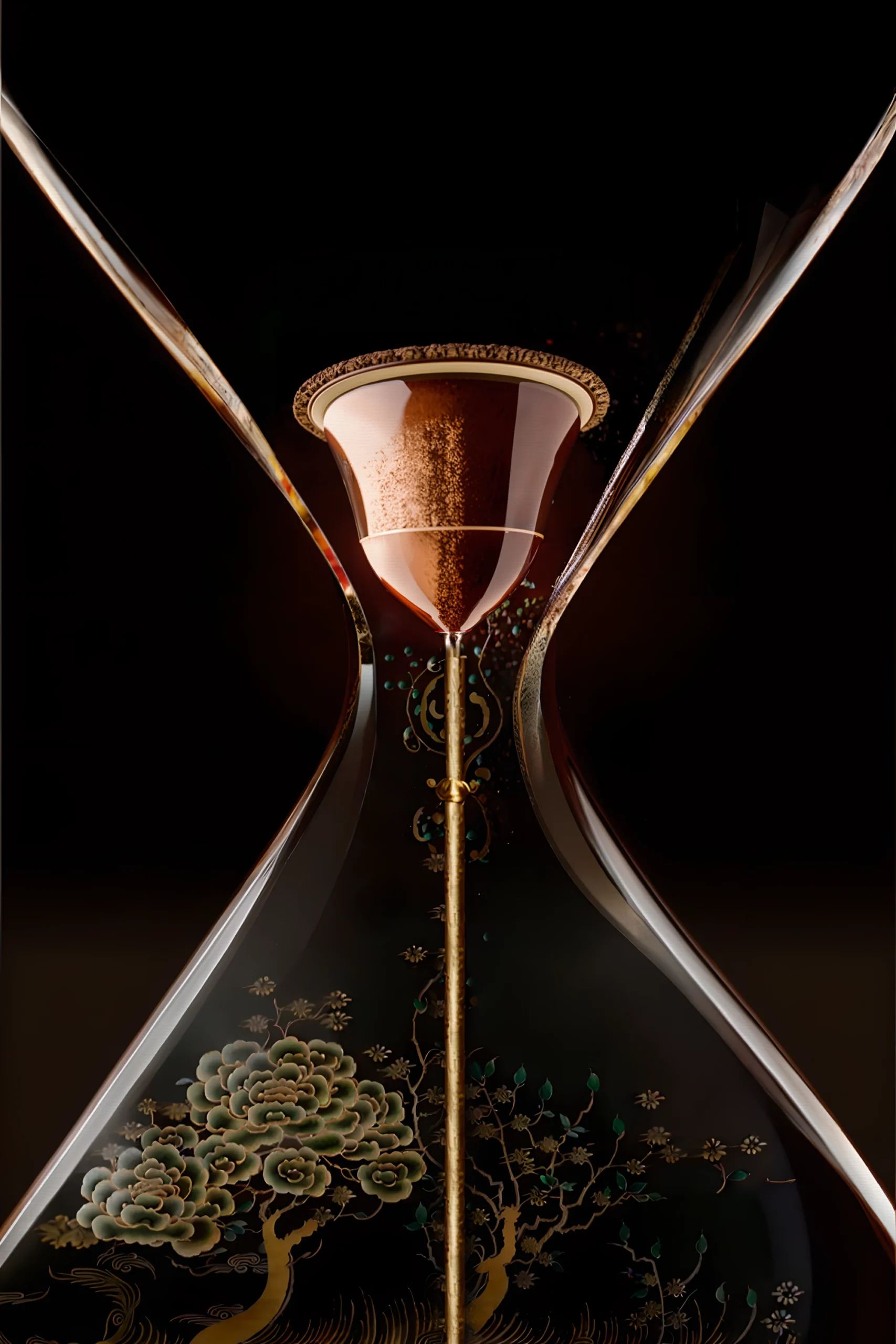
- Concept 1: The Lifecycle (The Hourglass)
- Visual: A capsule transforming into soil/dust within an hourglass, feeding a tree at the bottom.
- Message: “Born a capsule, leaving as dust.” This visualizes the zero-waste promise, framing time not as a deadline, but as a natural cycle of regeneration.
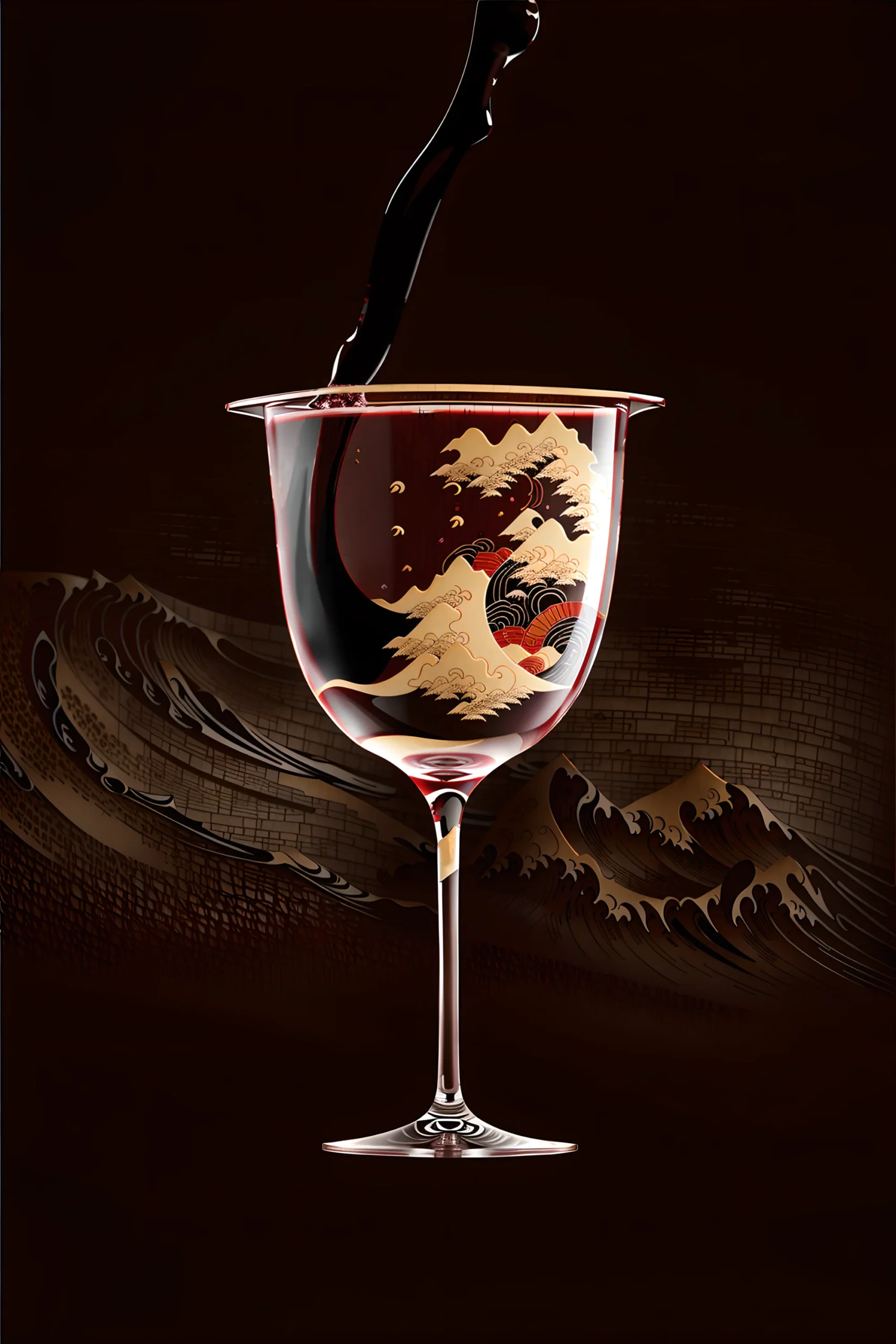
- Concept 2: The Taste Profile (The Wine Glass)
- Visual: Coffee pouring into a wine glass, morphing into the “Great Wave” off Kanagawa.
- Message: “Suave, Striking, Sublime.” By placing coffee in a wine glass, we borrow the codes of sommelier culture (tasting notes, robe, body). The wave represents the intensity and “crash” of flavor, elevating the product to an art form.
- Concept 3: The Aroma (The Abstract Steam)
- Visual: A cup where the steam forms a complex, golden graphic structure.
- Message: Visualizing the intangible. This targets the “olfactory” sense, suggesting that the aroma is as structured and designed as the machine itself.
The Result
A bold print campaign that differentiates the brand from the “utilitarian” look of standard supermarket products, positioning the biodegradable capsule as a high-art, guilt-free luxury.