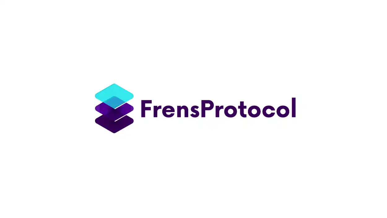
Frens Protocol

Visualizing the “Invisible Bridge” for Web3 Infrastructure
1. The Strategic Angle
Tech, Crypto, and Web3 represent the highest-paying sectors for premium branding and motion design. The Frens Protocol visual identity was built to capitalize on this by leveraging “Glassmorphism” and “Tech Stack” trends. The result is a clean, modern aesthetic that instantly communicates a “Scalable Startup” ready for enterprise adoption.
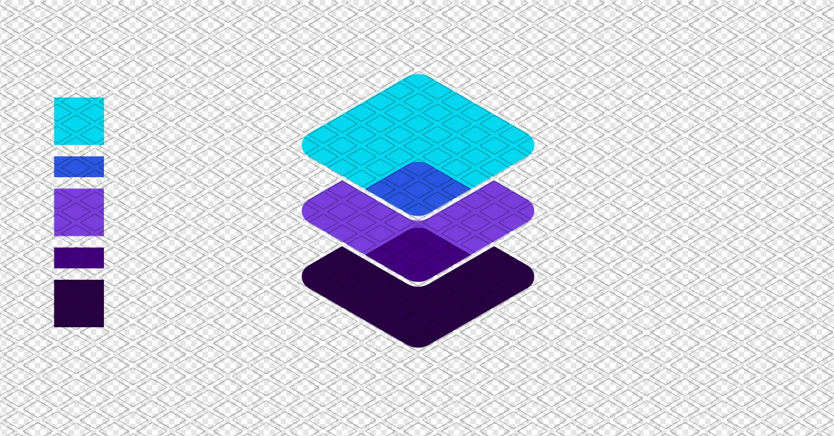
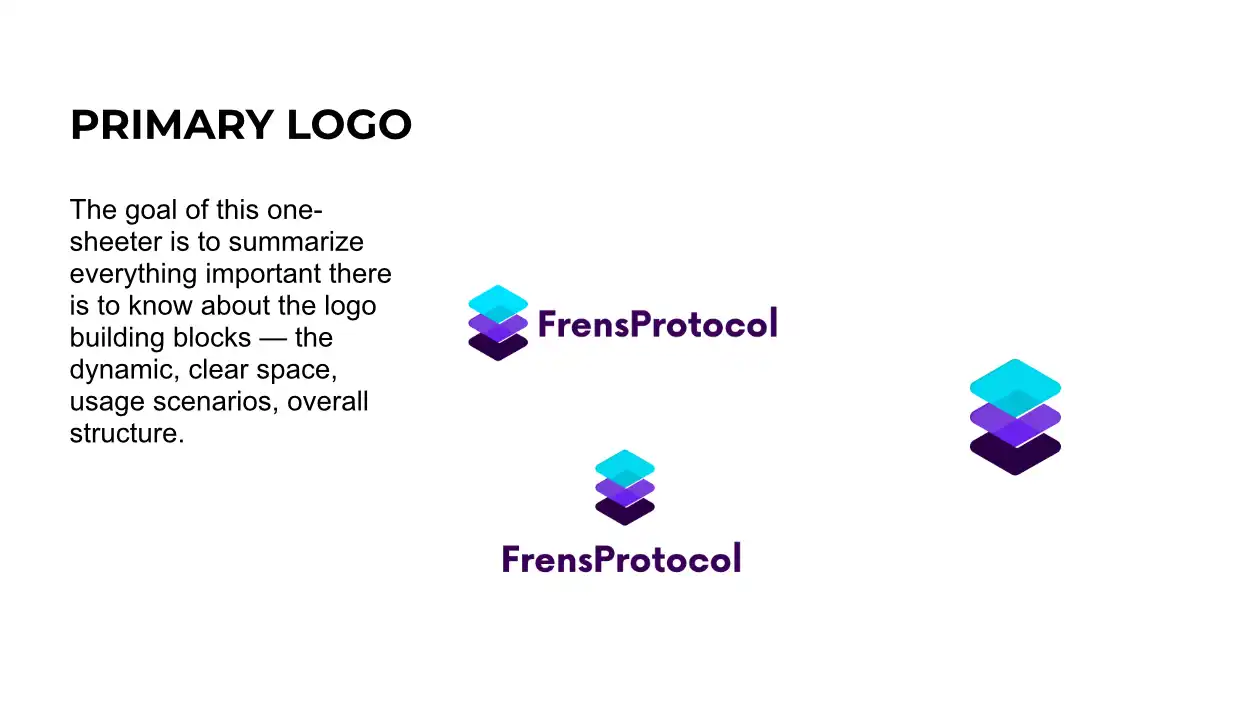
2. The Architecture of the Logo: The Tech Stack
- The Client: Frens Protocol, a “Layer 2” solution designed to secure social exchanges on the blockchain.
- The Concept: Transparency & Superposition. The branding relies on the idea that the protocol integrates invisibly on top of other applications.
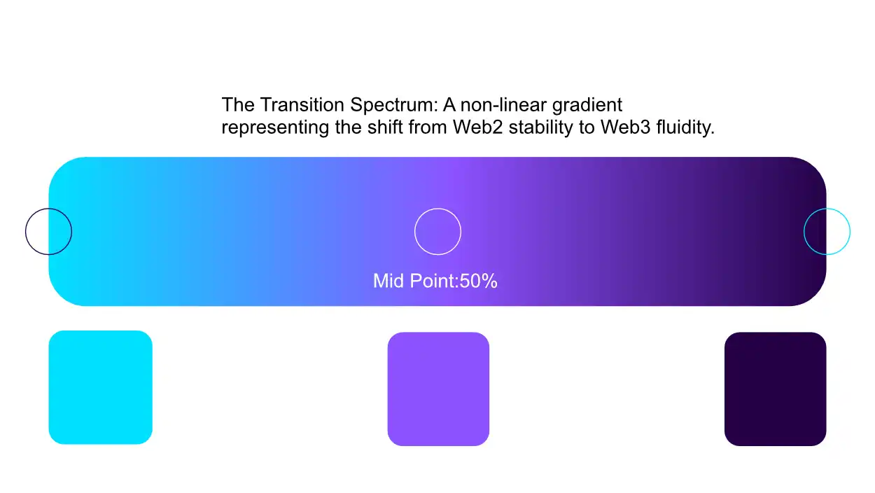
- The Visual Language: Isometric geometry combined with transparency and high-contrast gradients (Cyan/Violet). By elevating the logo from a flat 2D graphic into a “2.5D” glass object with light reflections, the design visually translates the concept of technical “Layers” and deep infrastructure.

 Before
After
Before
After 3. The Brand Book & System: Engineered for Dark Mode
This project was designed 100% for digital environments, heavily utilizing a premium Dark Mode aesthetic to make the neon brand colors pop.
- The “Glass Card” (Fintech UI Design): An abstract, floating interface element set against a near-black background. The logo acts as a brilliant glass foundation, overlaid with stark white financial data (e.g., “$4,230.50” or “+12% APY”) and backlit by a soft, diffuse glow. Purpose: Demonstrates the ability to design modern, high-trust Fintech interfaces.
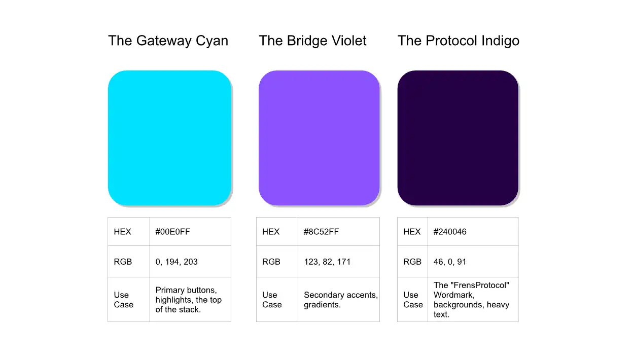
- Color & UI: The visual system is anchored in a deep Anthracite Grey Dark Mode environment, designed specifically to make the neon Cyan and Violet brand colors pop. This color logic scales seamlessly across abstract background patterns and high-trust Fintech UI dashboards.
- Motion Guidelines: The brand moves with “Engineered Easing.” We strictly avoided bouncy, cartoonish physics in favor of motion that is precise, magnetic, and frictionless. Elements snap together like server racks, projecting enterprise-grade stability and technical confidence.
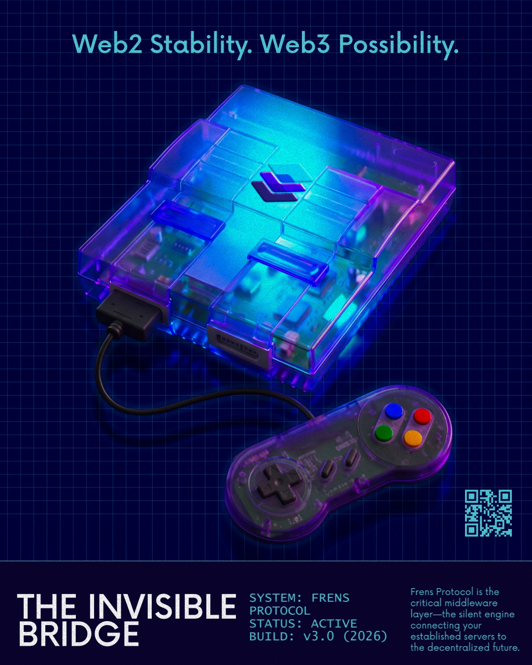
4. Poster Adaptation: The Retro-Futuristic Console
 Before
After
Before
After The Metaphor: Middleware is notoriously difficult to market because it is invisible. To solve this, we used a universally understood visual metaphor: a translucent “Atomic Purple” 90s game console. A console is the ultimate middleware—it processes complex code so the user can simply play.
The Layout: Designed specifically for “The Feed,” this asset uses a 4:5 vertical format. It combines cinematic, ray-traced product rendering with strict, Swiss-style typography at the footer, blending high-end nostalgia with modern campaign system design.
5. Community Expansion: The Twitter Mascots
The Strategy: Web3 communities live on X/Twitter and thrive on lore. To give the brand a voice without diluting the premium tech aesthetic, we developed “The Bit-Bridge Engineers”—a mascot designed in a premium, modern “Hi-Bit” pixel art style reminiscent of the SNES era.

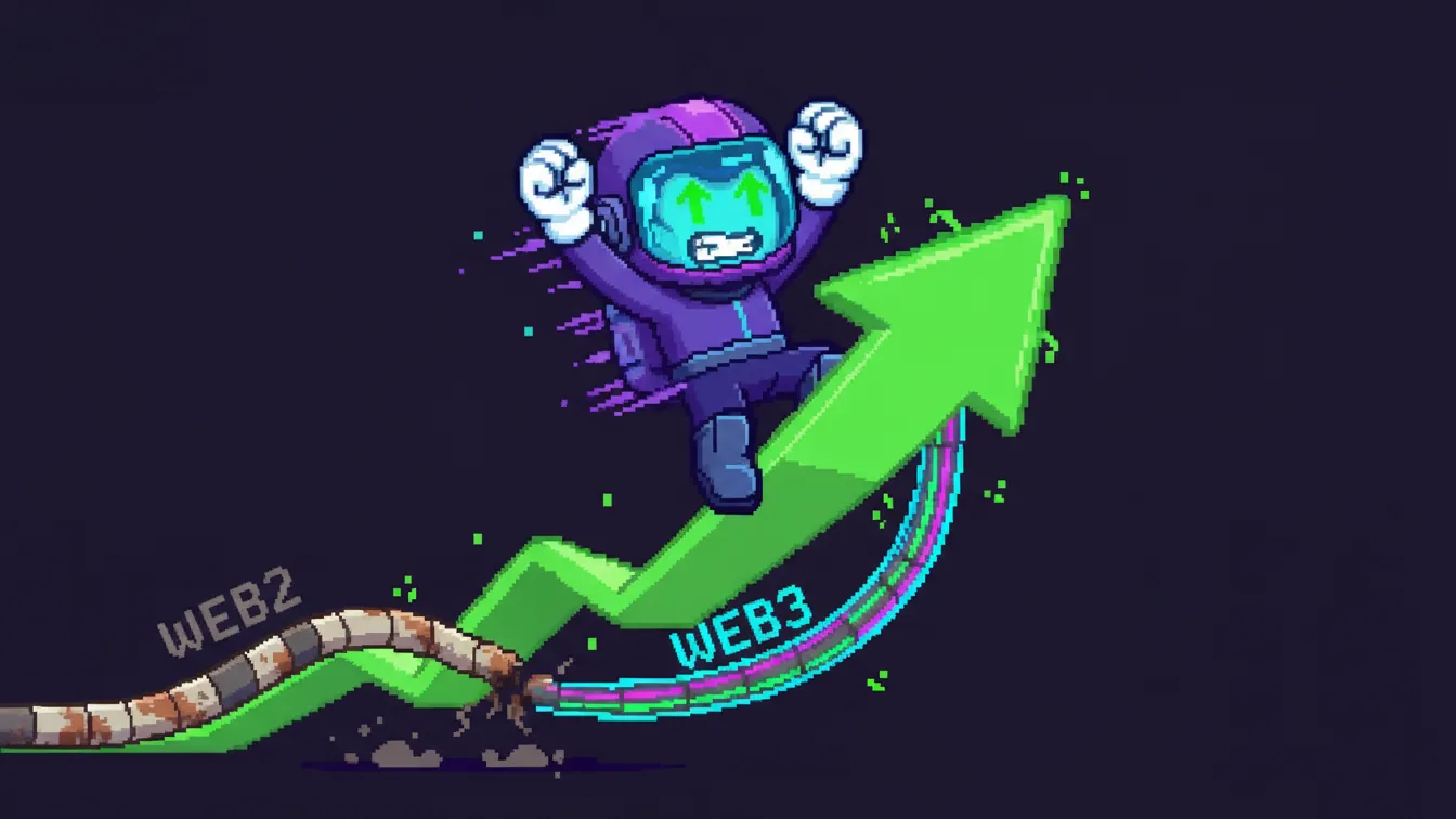
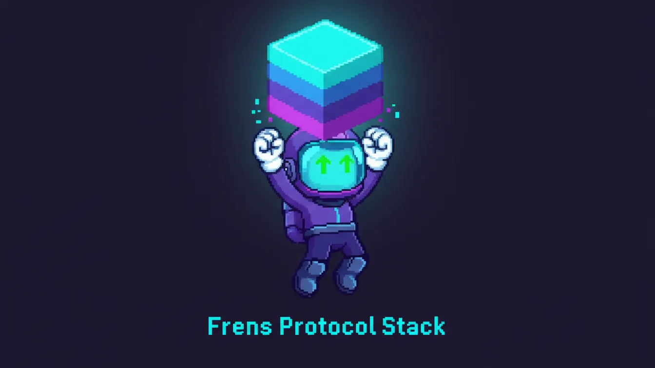
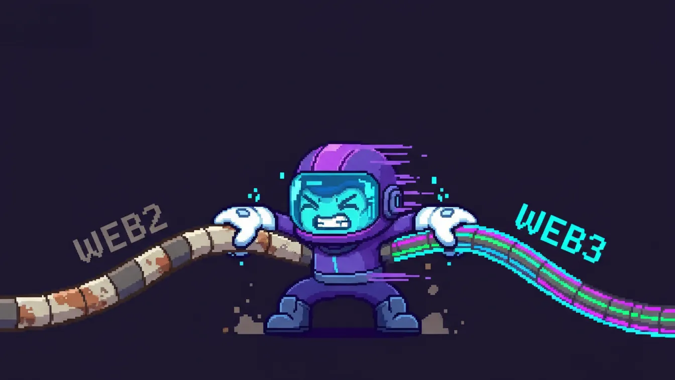
The Asset Pack: We built 4 modular illustrations specifically for the social media manager’s daily use:
The Glitch Fixer (Blueprint)
The Bullish Scale (Green Arrow)
The Diamond Hands (Holding the Stack)