Fête le Mur: Inside One Nonprofit’s Design Pipeline
Recurring design work for one nonprofit over many years, and still open whenever a new edition needs it: an illustration system, a 122-page annual report, national event collateral, an accessibility program, and a social pack, all built on one consistent visual language.
2
Tournament shirt editions
122
Page annual report
9
Illustration system
11
Sponsor brands handled
6+
Deliverable categories
Fête le Mur is the non-profit Yannick Noah founded in 1996 to bring free tennis to France’s underserved neighbourhoods. It has no in-house design team. I first played there as a child, taught there from the age of 16, did my graphic design internship there around 2010 with its communication manager, and kept designing for it for years afterwards.
Illustrations, posters, reports, event shirts and funding documents all came from the same hands, which is why they read as one organisation. This page shows the work.
Deliverable 01: Illustration System
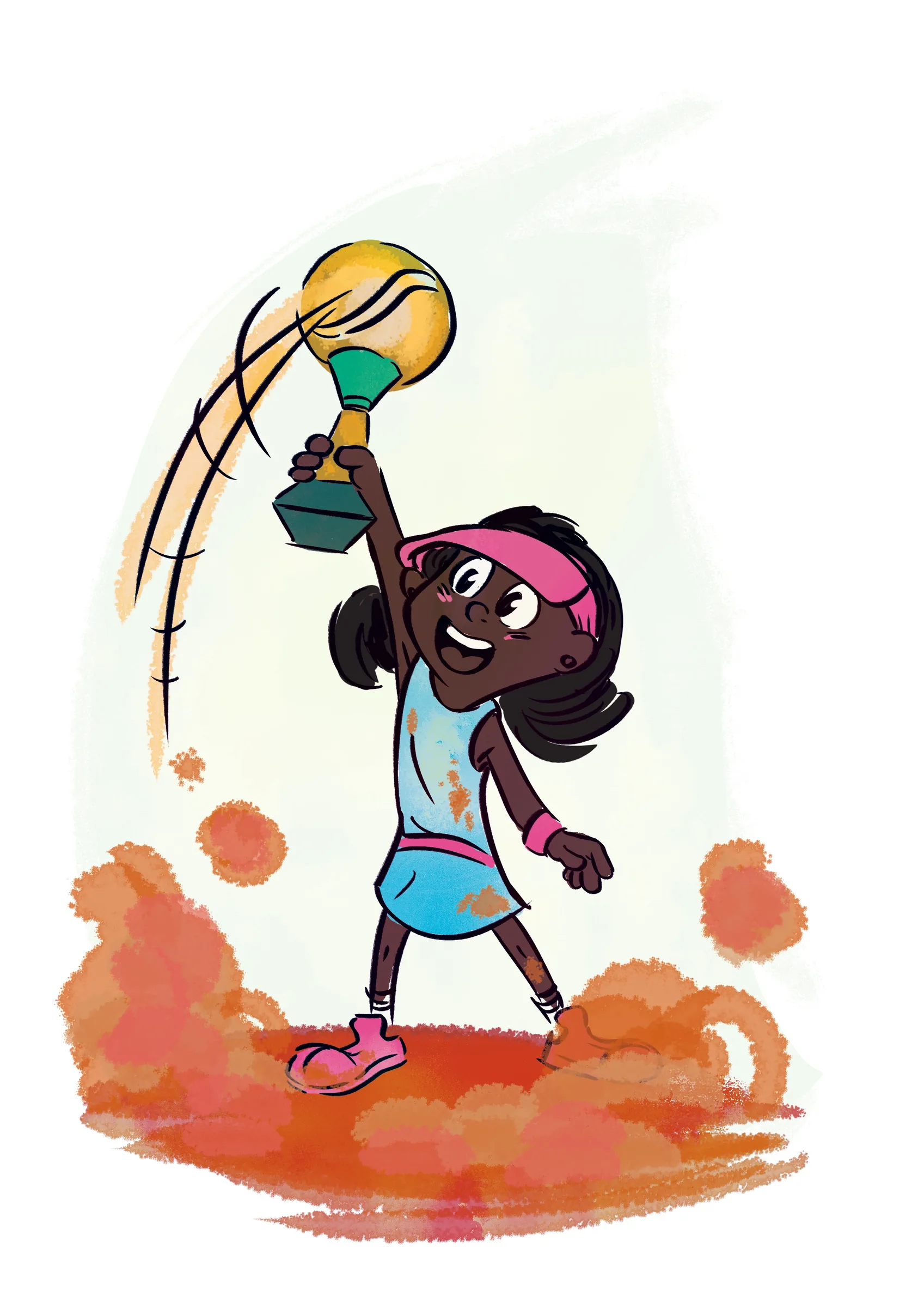
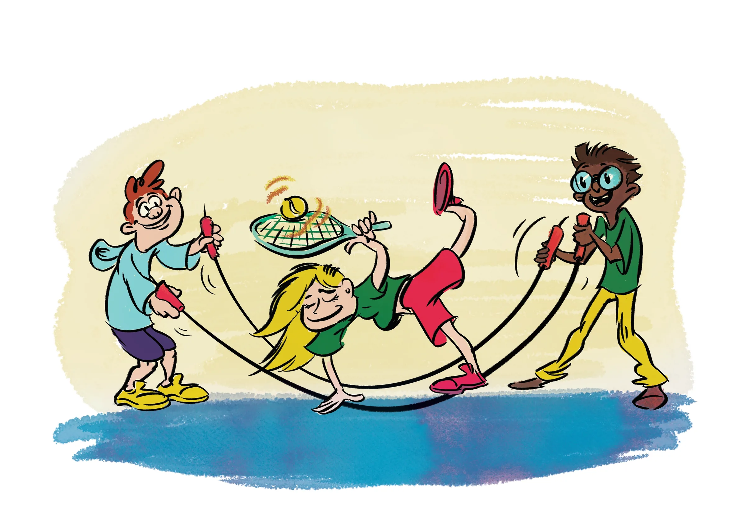
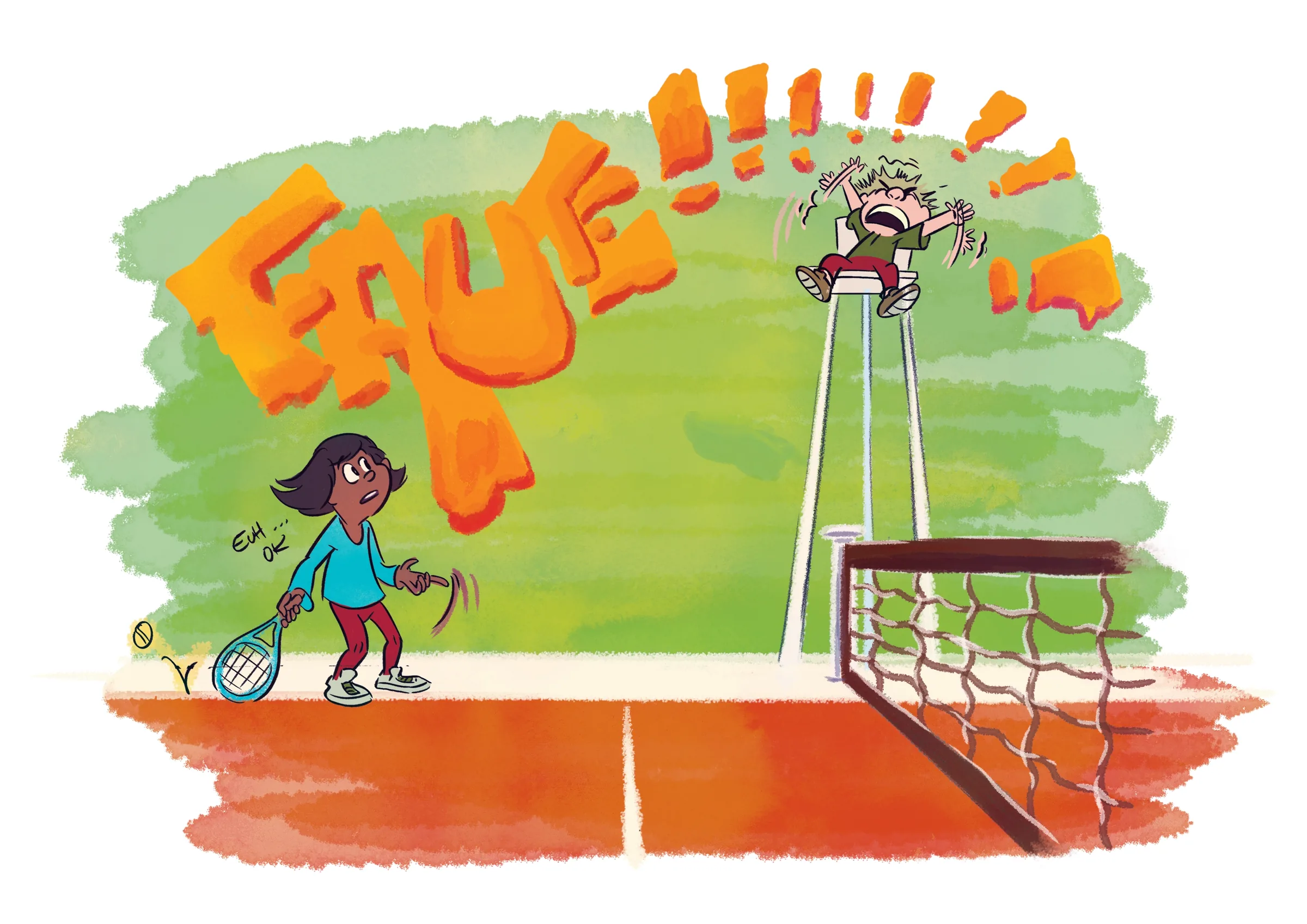
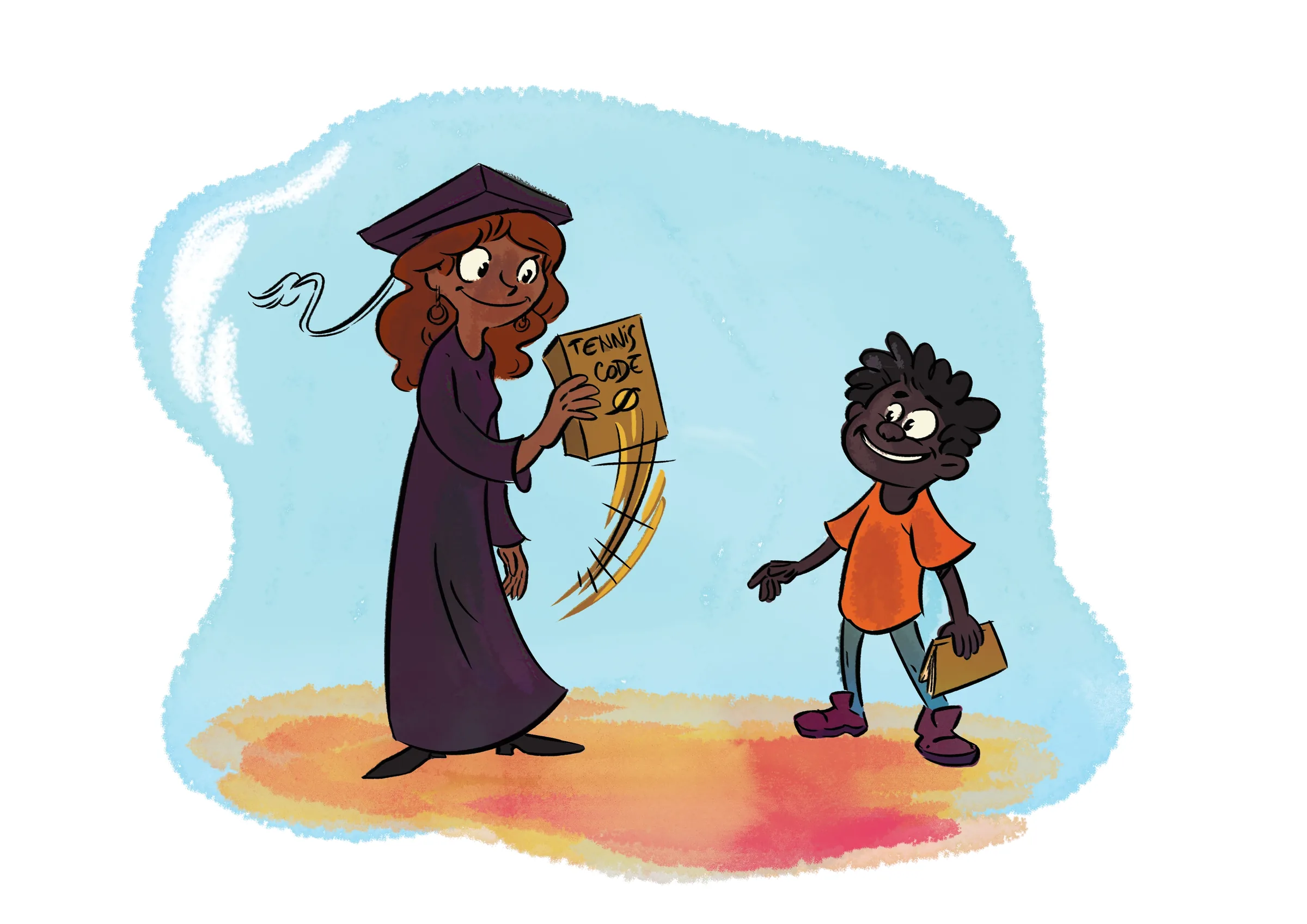
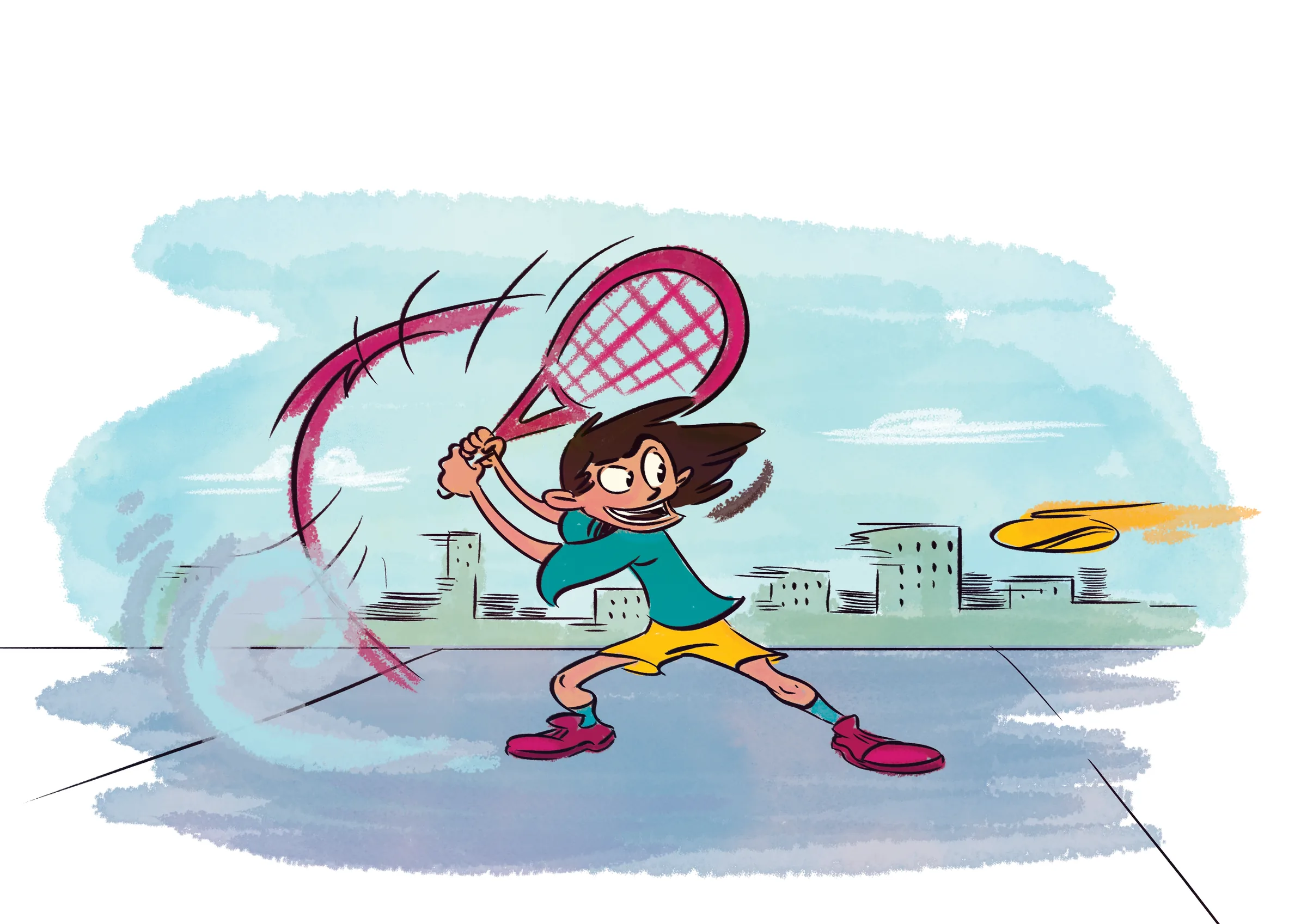
One cast of characters, built to carry nine different programs.
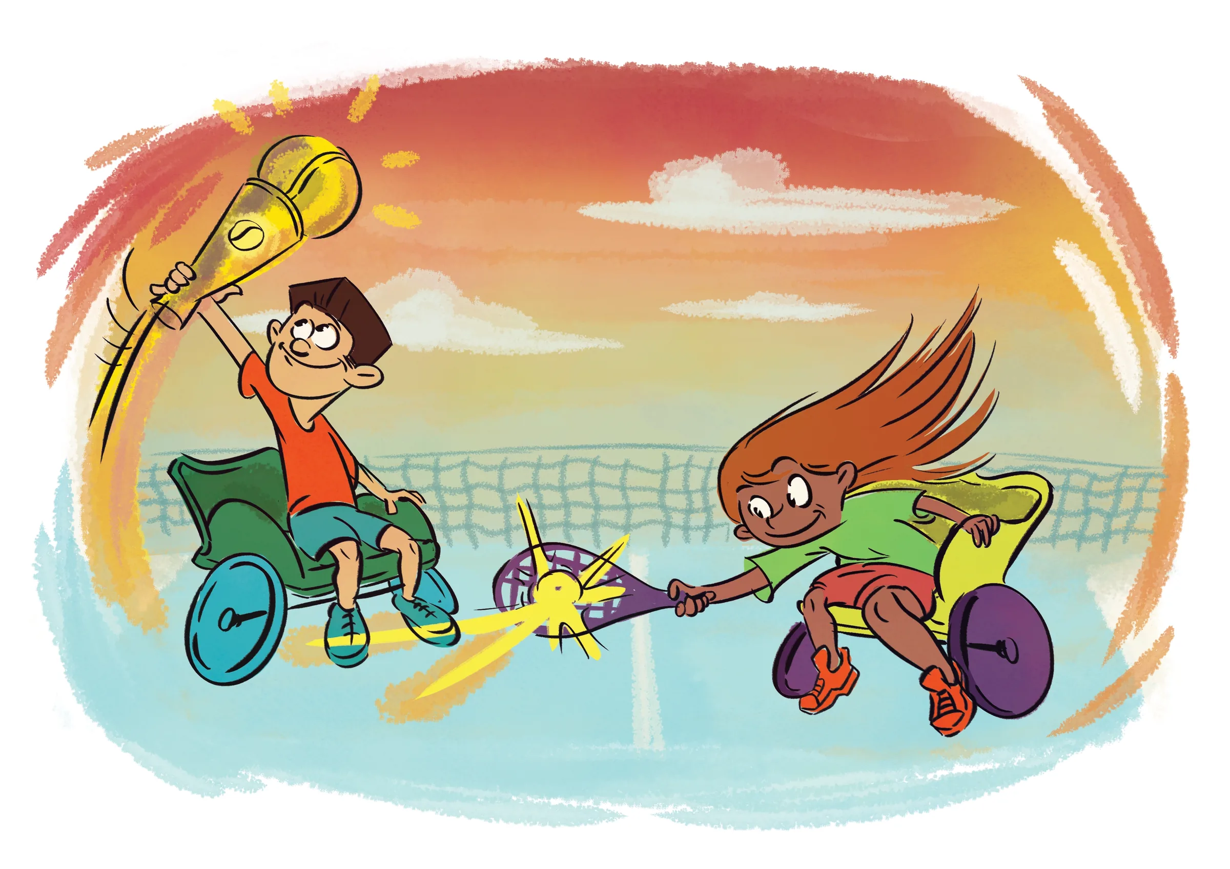
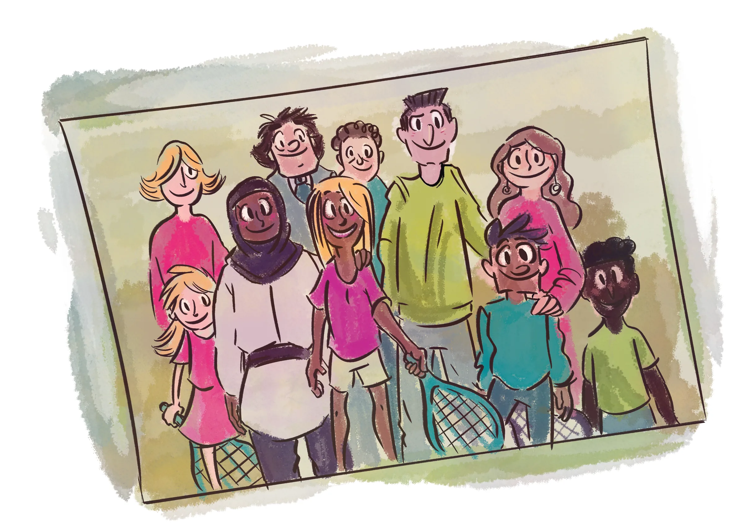
Each theme (refereeing, competition, outreach, wheelchair tennis) got its own fully painted A1 illustration, all drawn to read as one consistent brand world. These became the visual backbone every other deliverable below was built on.
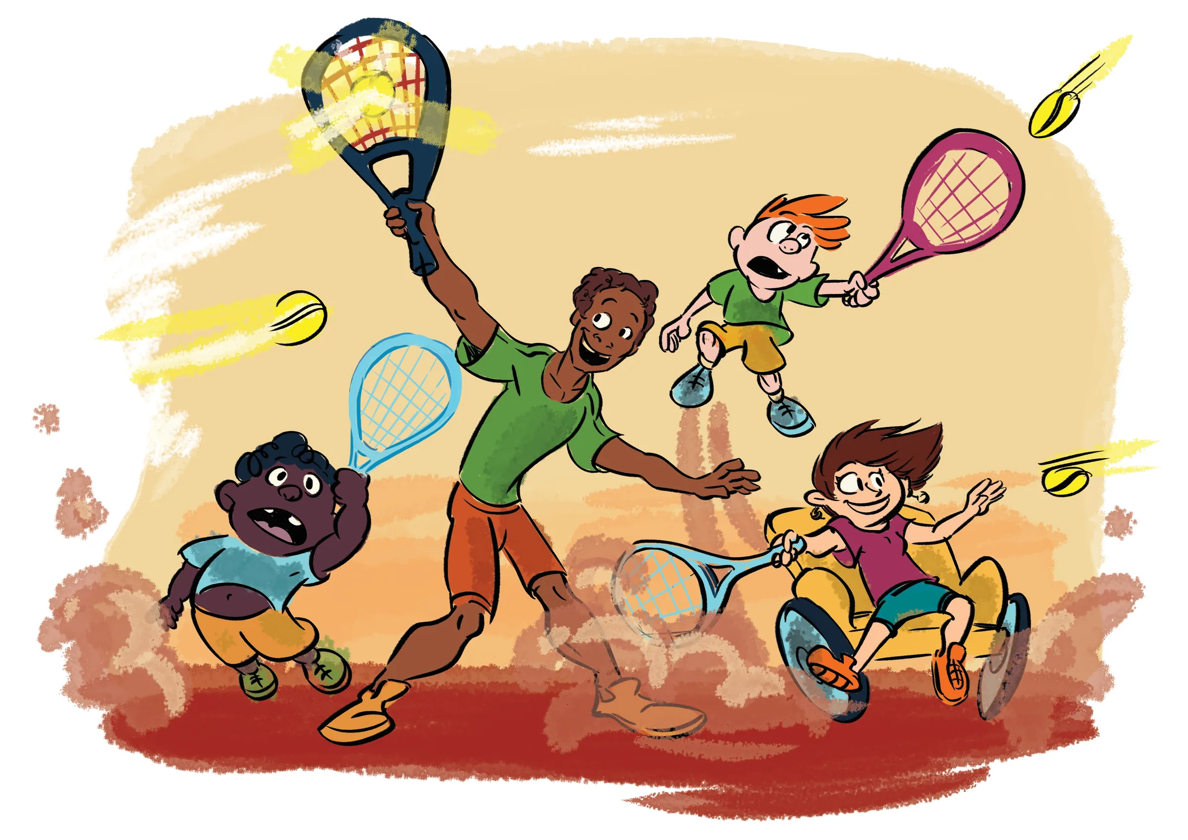
Illustration system · Style rationale
Why a cartoon style, and why these colours
Fête le Mur reaches children and families through posters, school notice boards and a stranger’s phone screen. A cartoon cast can do what a photograph can’t: put a kid in a wheelchair, a referee on a high chair and a yellow bus flying to Paris into the same scene, and stay friendly when a sponsor’s logo sits beside it. Big gestures and exaggerated faces also keep every character readable at thumbnail size.
The palette starts from the clay court. Burnt orange and brick carry the warmth, ball yellow signals energy, and cool sky and teal washes give each scene air so the characters stay the loudest thing on the page. Each programme gets its own dominant wash, green for refereeing, sky blue for outreach, sunset for wheelchair tennis, so nine posters read as nine chapters of one story.
Brush-edged watercolour backgrounds keep the A1 sheets from feeling like clip art, and confident, clean linework holds the faces and hands together.
Clay court
#D26240
Ball yellow
#E9B22A
Sand
#EDD092
Grass
#A4B759
Sky
#96CFDE
Teal
#3690AB
Brick
#A13933
Line work
#4E3B38
Palette sampled from the nine A1 illustrations.

Deliverable 02: Event Collateral
A national poster, produced inside eleven real brand guidelines at once.
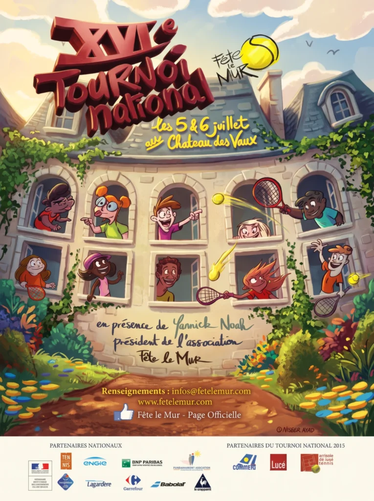
Not a mood board. A compliance exercise.
The national tournament poster had to seat ten illustrated characters, the FLM wordmark, and eleven partner logos on one sheet, each one placed inside that sponsor’s own usage guidelines. BNP Paribas, the French Ministry of Sport, Carrefour, Lagardère, FDJ and ENGIE all signed off on the same page.
+ Ministère de la Ville, de la Jeunesse et des Sports · BNP Paribas · ENGIE · Fondation MAAF · FFT · Babolat
Deliverable 03: Tournament Shirts
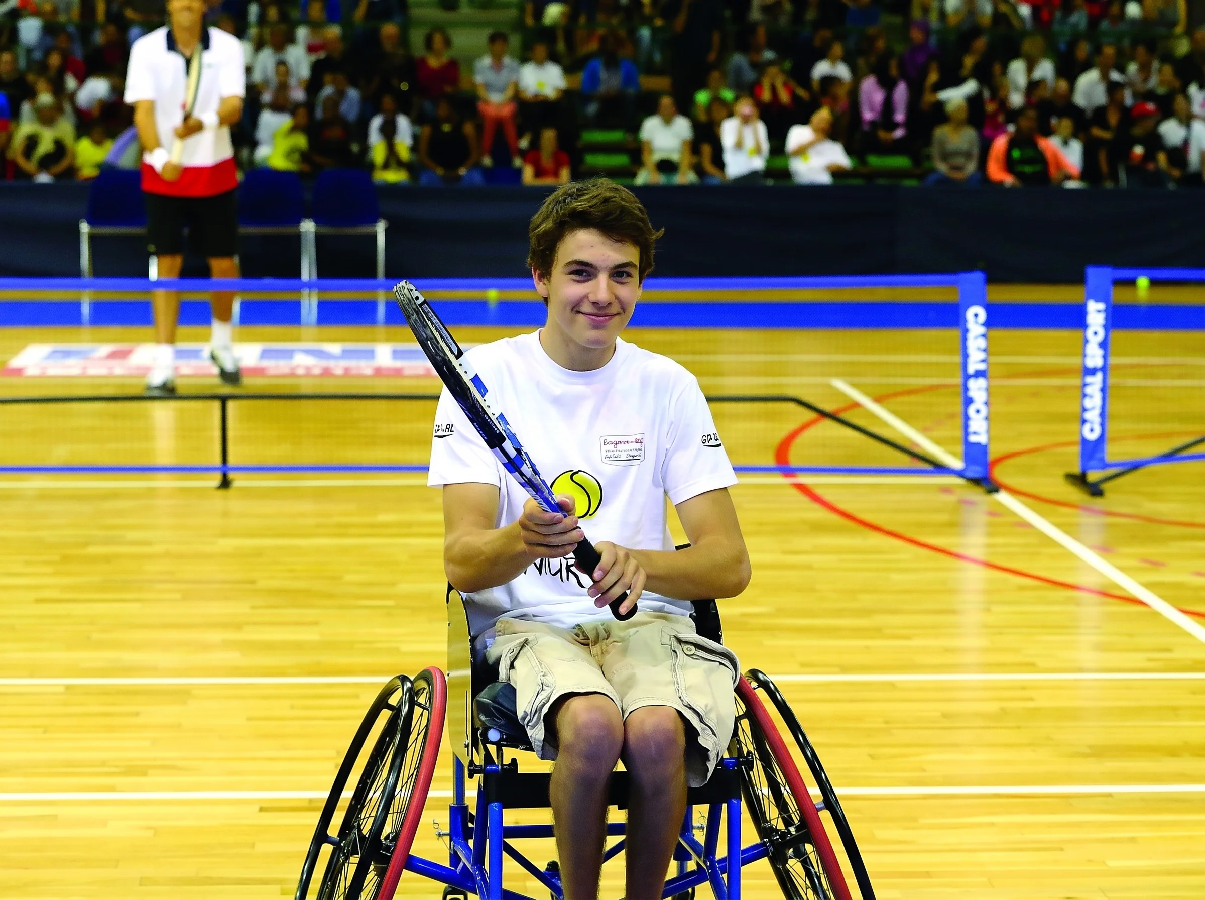
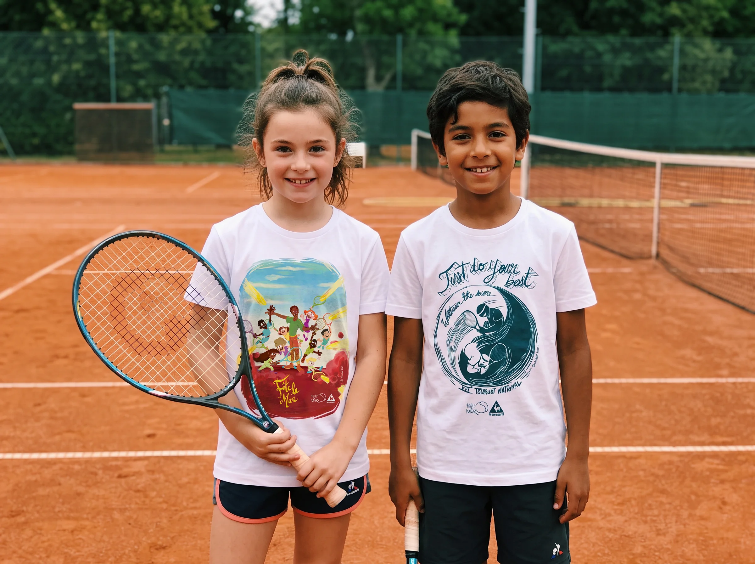
Two tournament shirts, worn by the children at the national event.
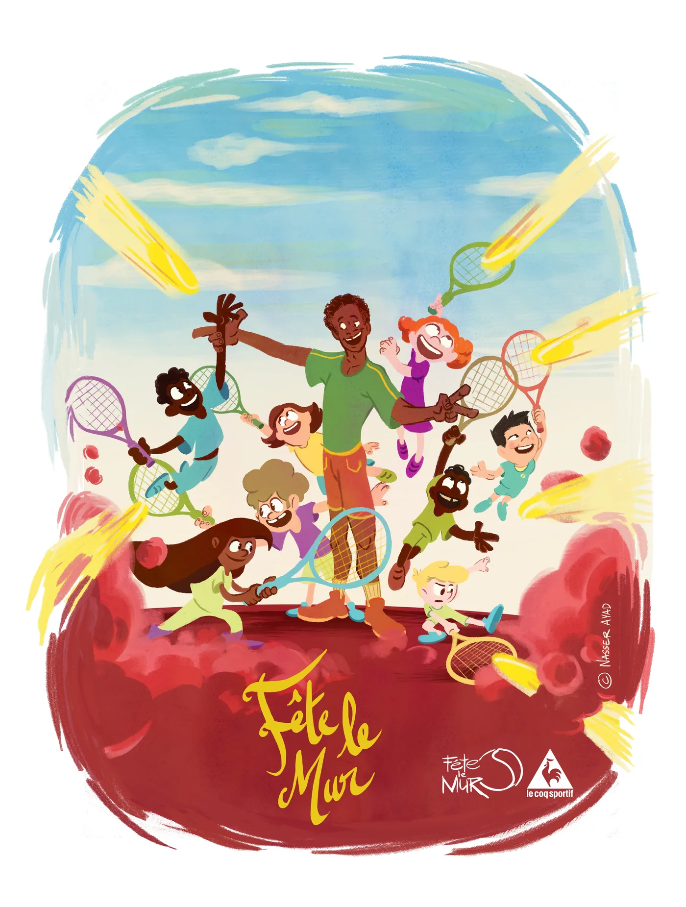
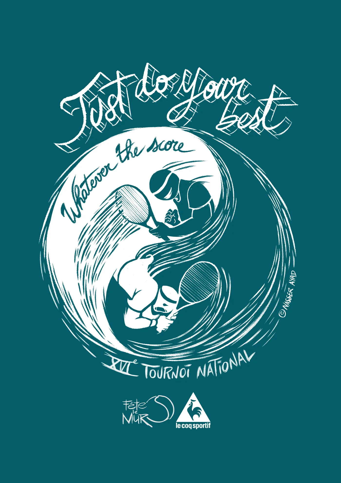
Artwork for two editions of the tournament shirt (2015), co-branded with Le Coq Sportif. The one-colour design was also adapted for an event in Douala.
In collaboration with Le Coq Sportif
Deliverable 04: Greeting Cards
The annual card: a small job that sets the tone for the year.
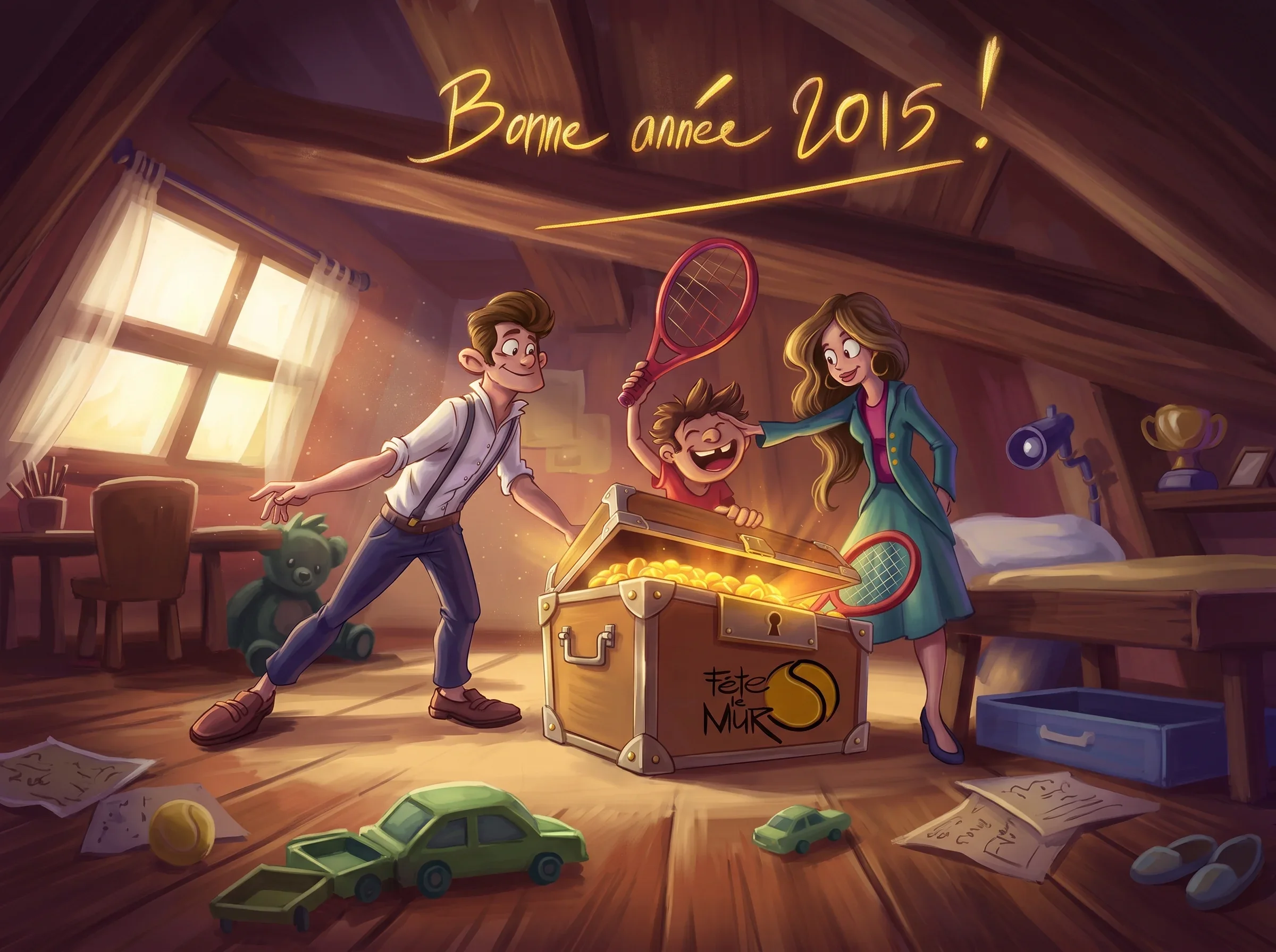
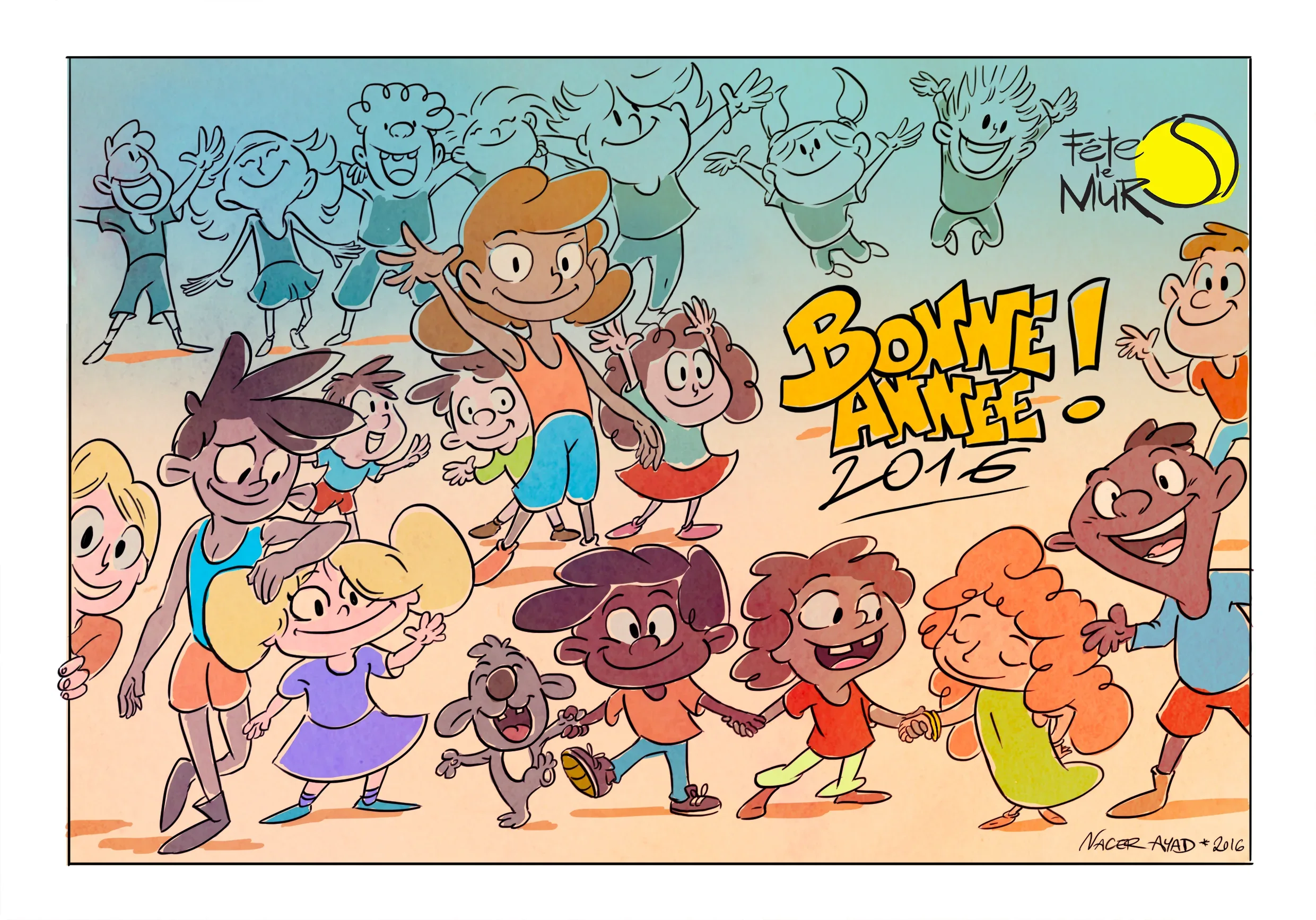
New-year cards drawn for Fête le Mur, a different idea each year on the same brand. The 2015 card is a warm, painted attic scene; the 2016 card uses the cartoon cast and a hand-lettered greeting.
Two cards, two years of new-year wishes.
One painted and lit like a film still. One in the cartoon cast of the brand system.
Deliverable 05: Annual Report
122 pages. Five parts. One InDesign file, exported six different ways.

Print-ready files
Press-ready, crop marks and all.
I deliver the report the way a printer wants it: every page exported with crop marks and colour bars, at full print resolution, ready for the press. The pages below are straight from those production files.
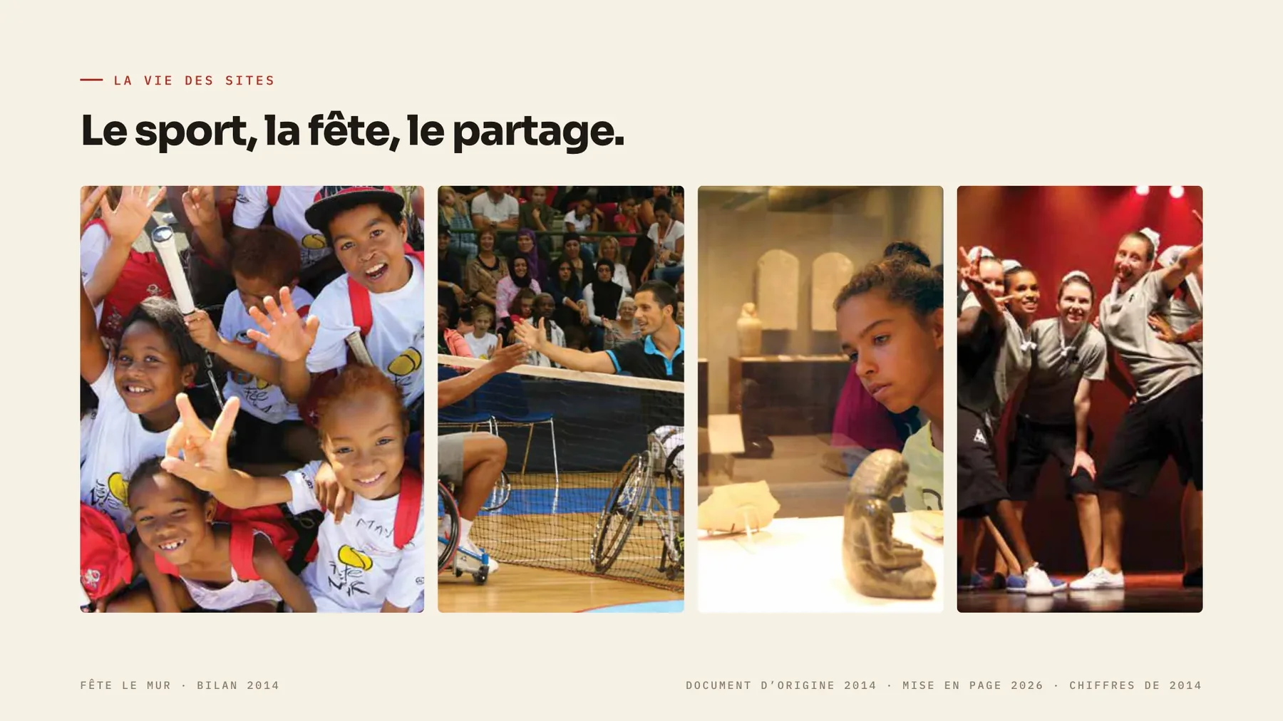
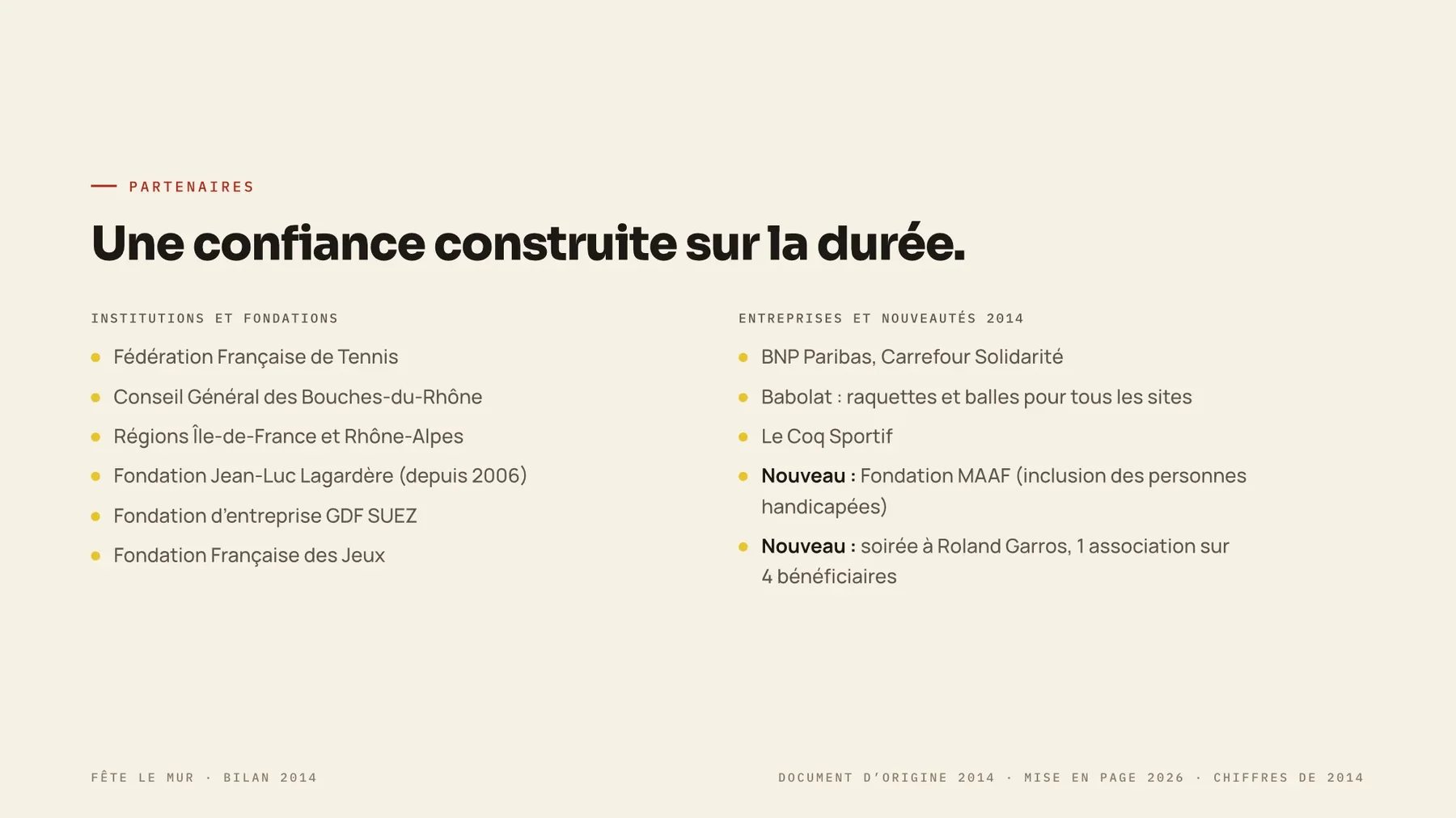
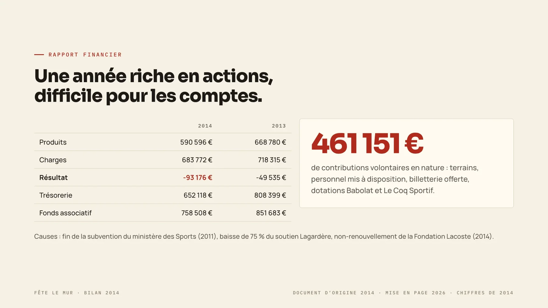
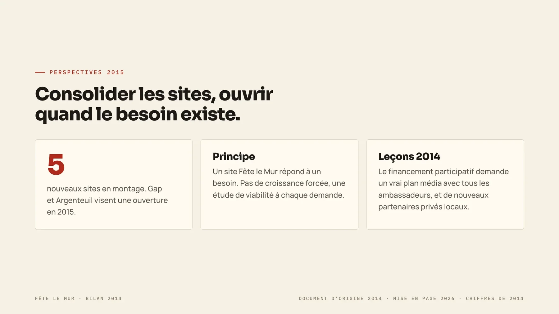
Preamble, general presentation, the year in review, partners, and financial report, the full structure a grant renewal gets judged on. Built once in InDesign, then exported for every channel it had to reach.
- PRINT-READY Crop marks + colour bars, high resolution
- A2 · PRINT Simple + double-page layouts
- B1 · LARGE FORMAT Simple + double, with/without trim marks
- WEB Basse-déf optimised, double + simple
- SRC Live InDesign file, fonts + links packaged
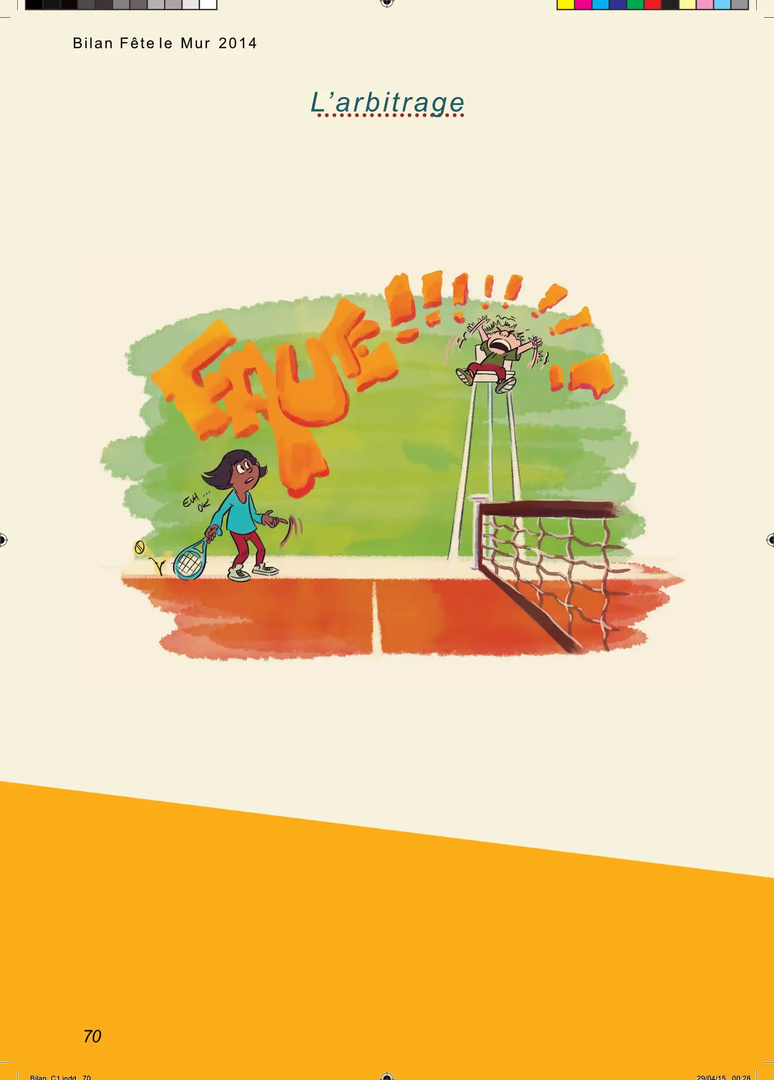
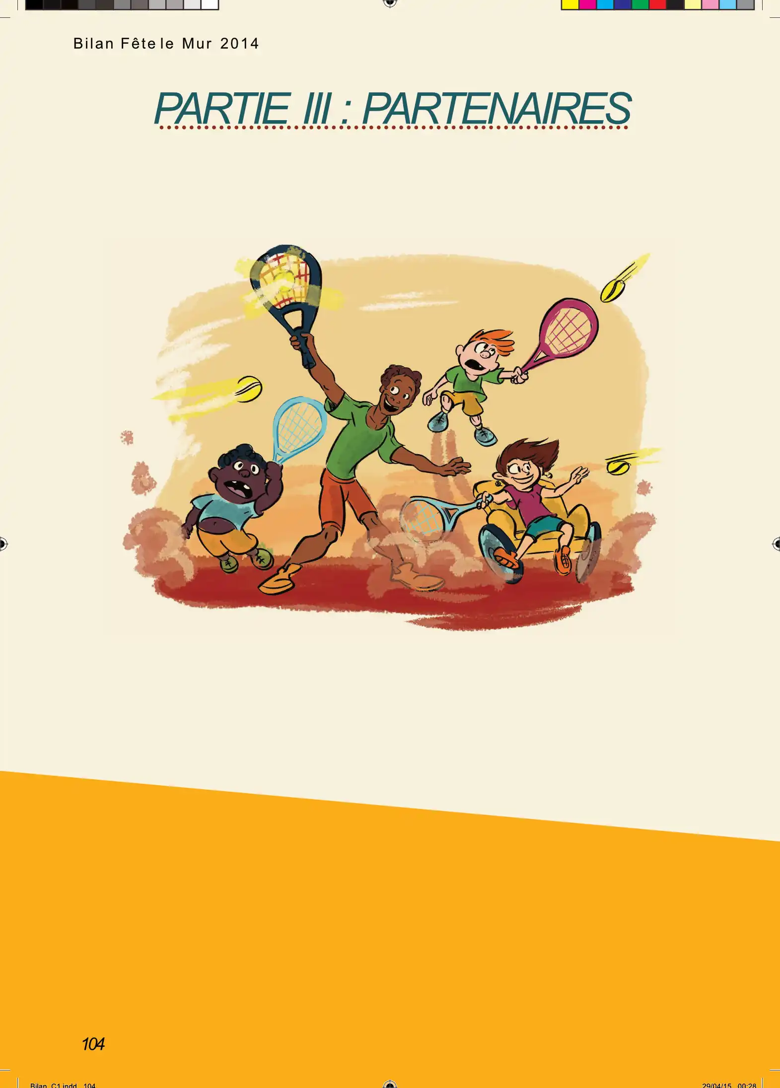
Inside the book · four pages as they print
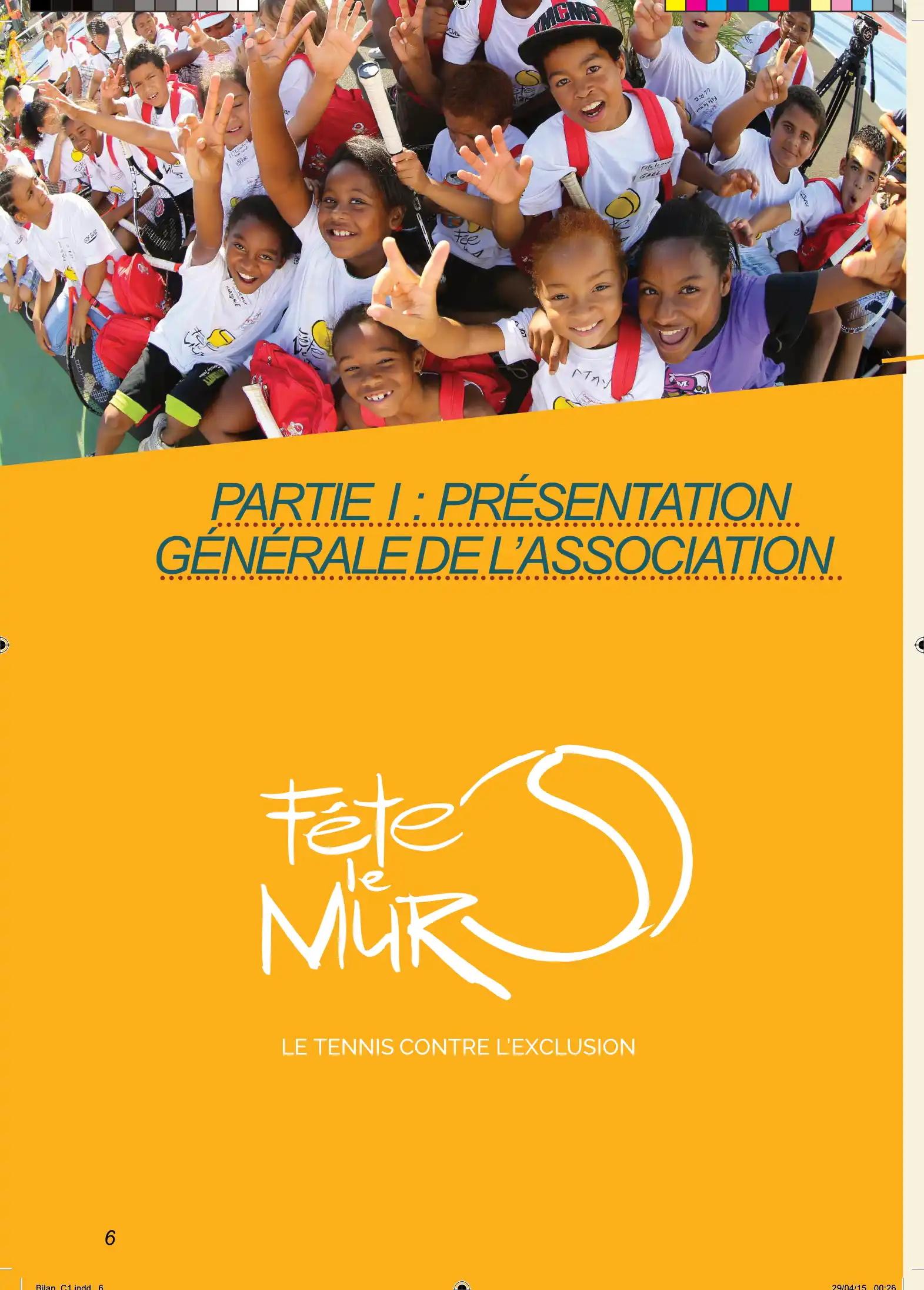

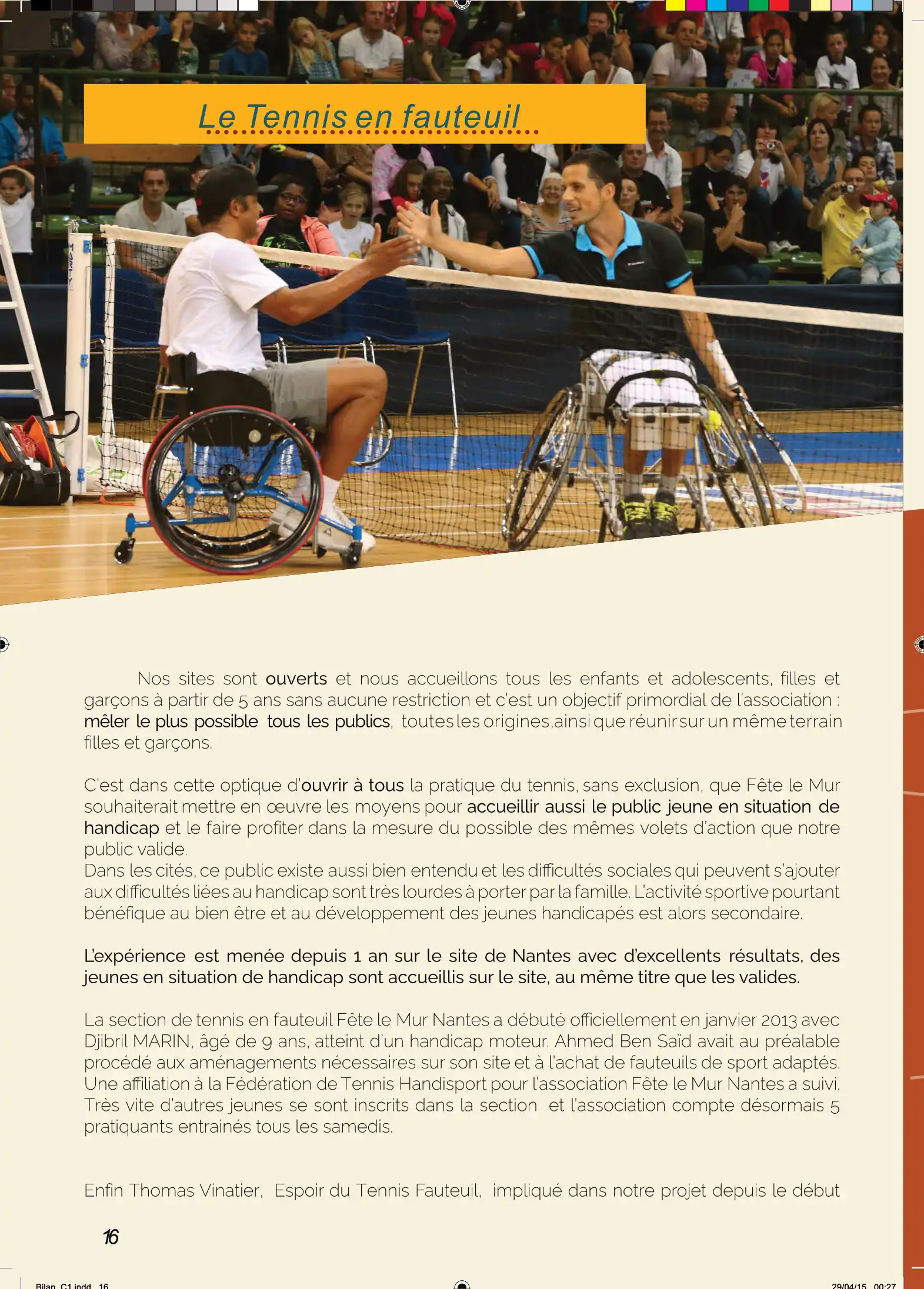
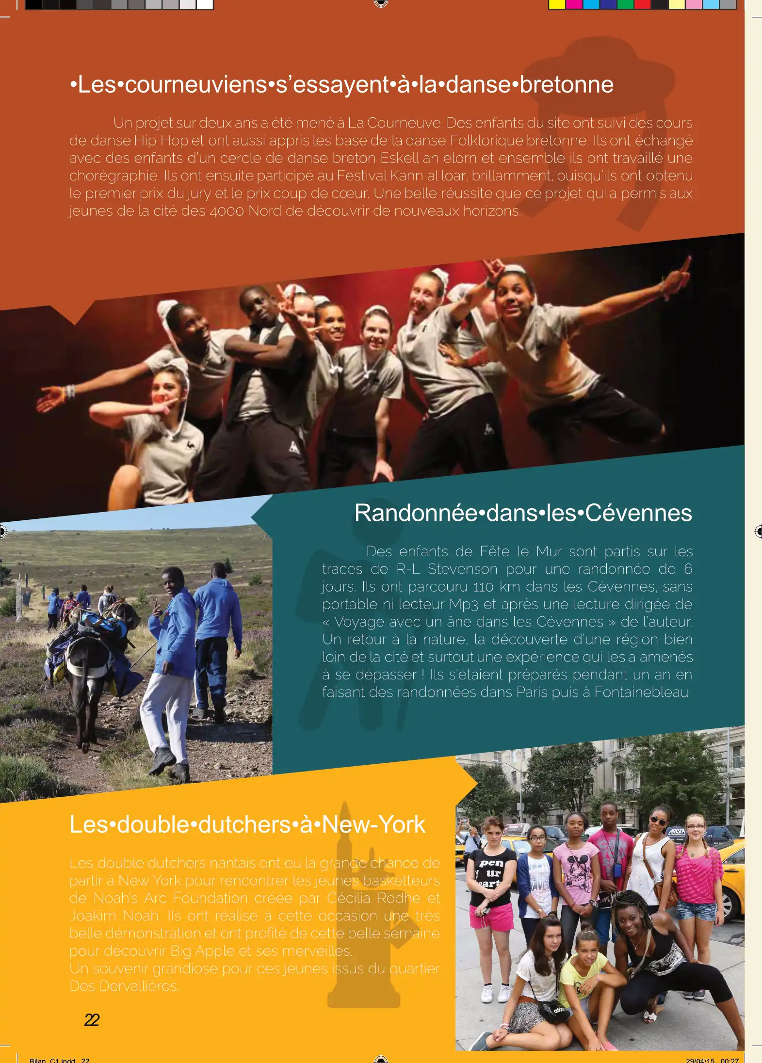
Contents and illustrated dividers

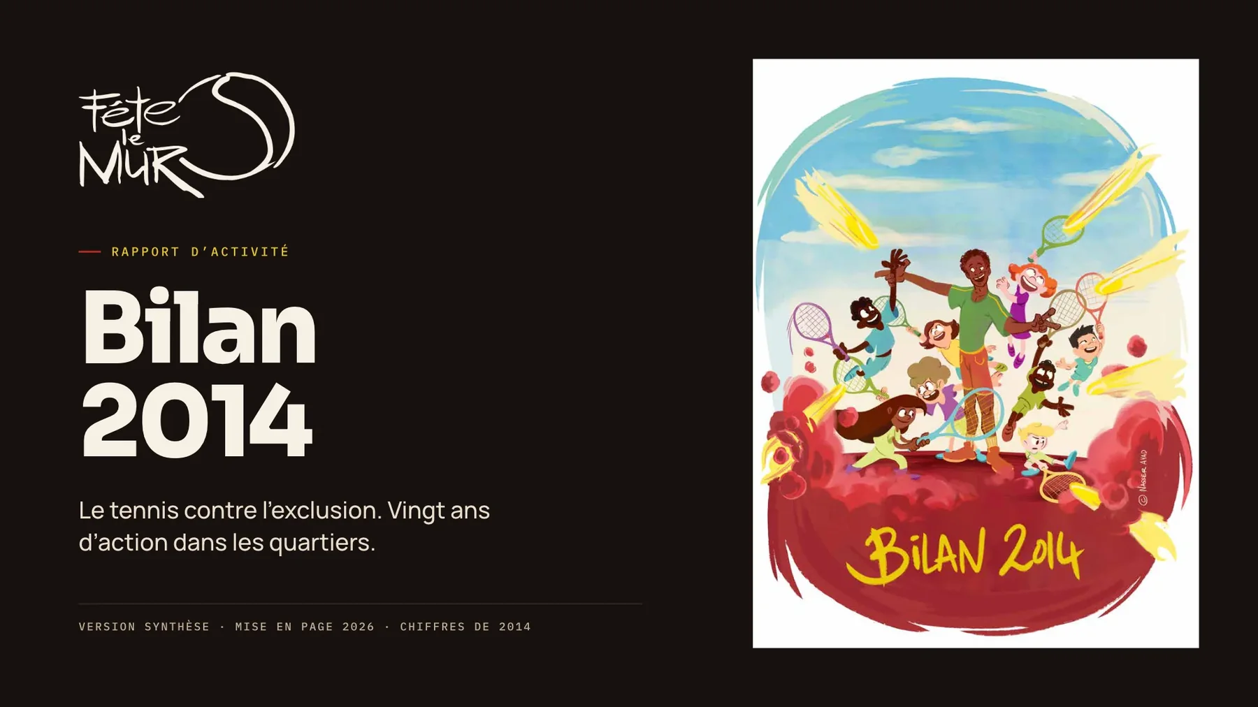
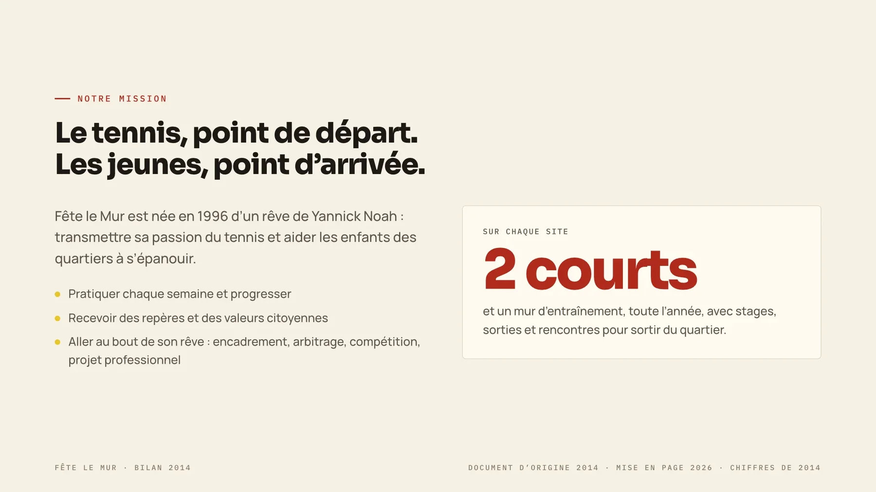
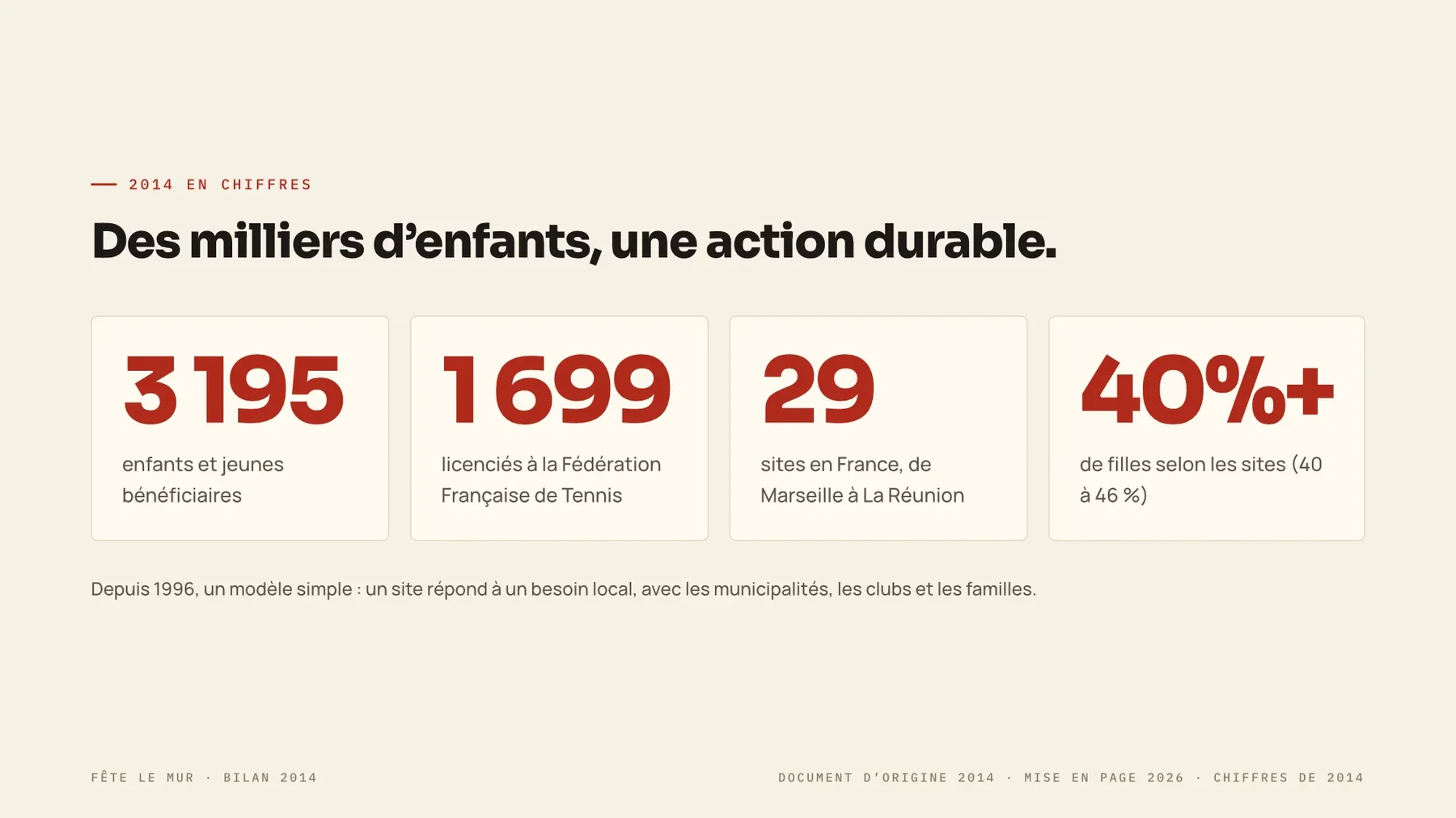
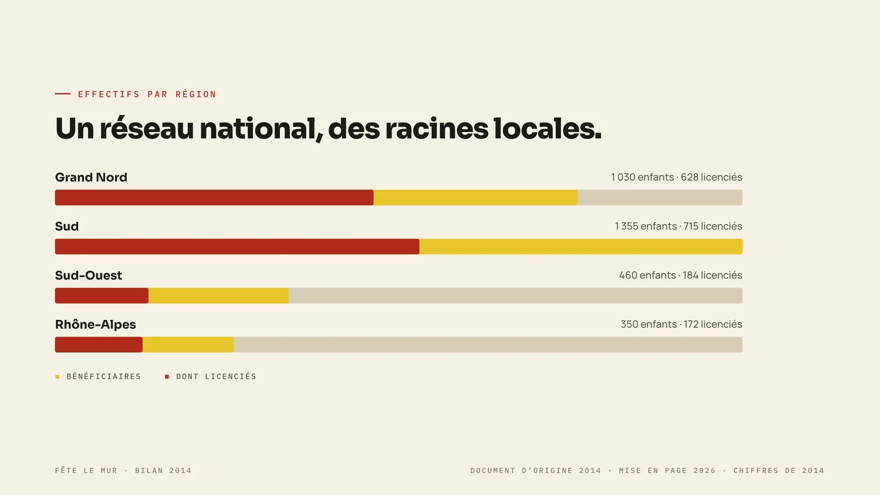
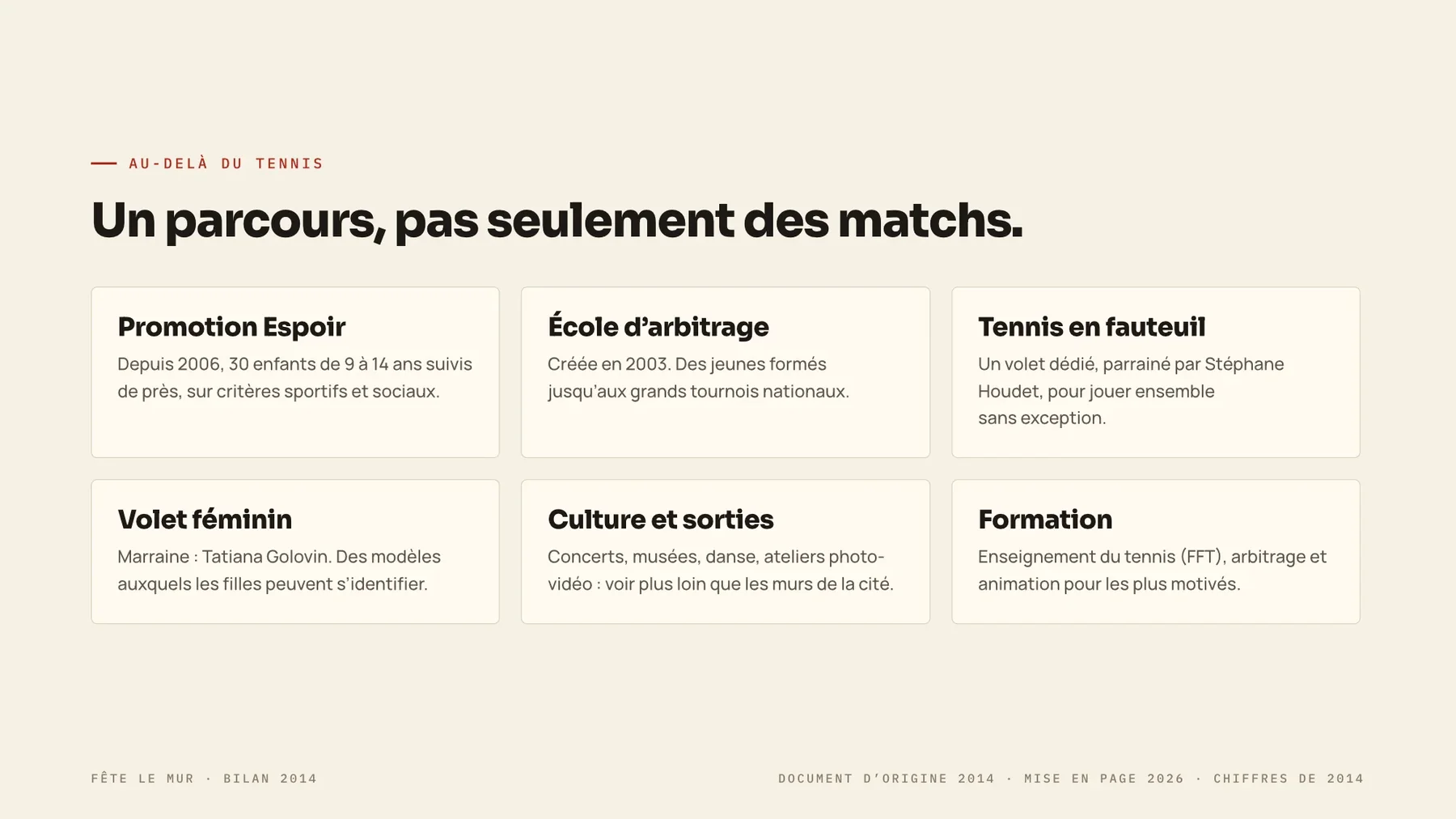
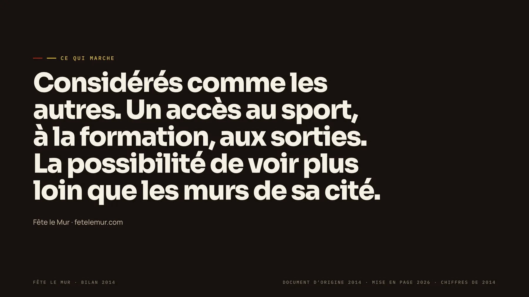
The 2014 summary, re-laid out in 2026
An editable ten-slide summary of the 2014 report, rebuilt from its own figures and photography: a cover, eight data pages and a closing statement. Copy is in French, as in the original.
Deliverable 06: Accessibility Program
The brochure that got wheelchair tennis funded in the first place.
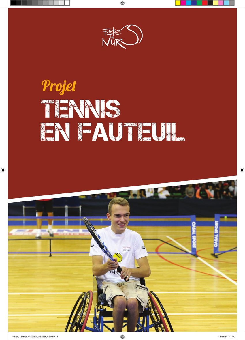
The Nantes wheelchair-tennis section launched in January 2013 from this pitch document, the one that justified funding four adapted sport wheelchairs at €1,300–1,900 each. Three years later it had a world top-30 competitor training inside it.
5
Young players in training
#28
World ranking, lead competitor
4
Adapted wheelchairs funded
€1.3–1.9K
Cost per chair
The pitch, rebuilt as nine editable slides
The original 2014 pitch re-laid out in 2026 for projection and sharing: origin, the Nantes section, the three-year plan and the ask. Copy is in French, as in the original.


Deliverable 07: Social Campaign · 2026 concept
The same brand voice, rebuilt for the formats that didn’t exist in 2015.
More than a decade after the original work, the same photography and the same program data got a second life: a six-format social pack, feed posts, story covers and a LinkedIn partner ask, pulled from Fête le Mur’s own archive and regraded for today’s platforms. Delivered as editable files; the English versions are shown.
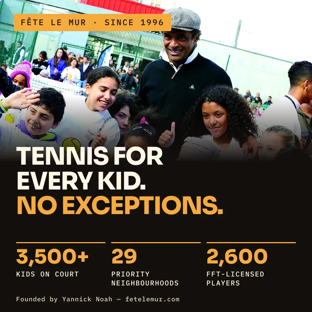
Scale and reach
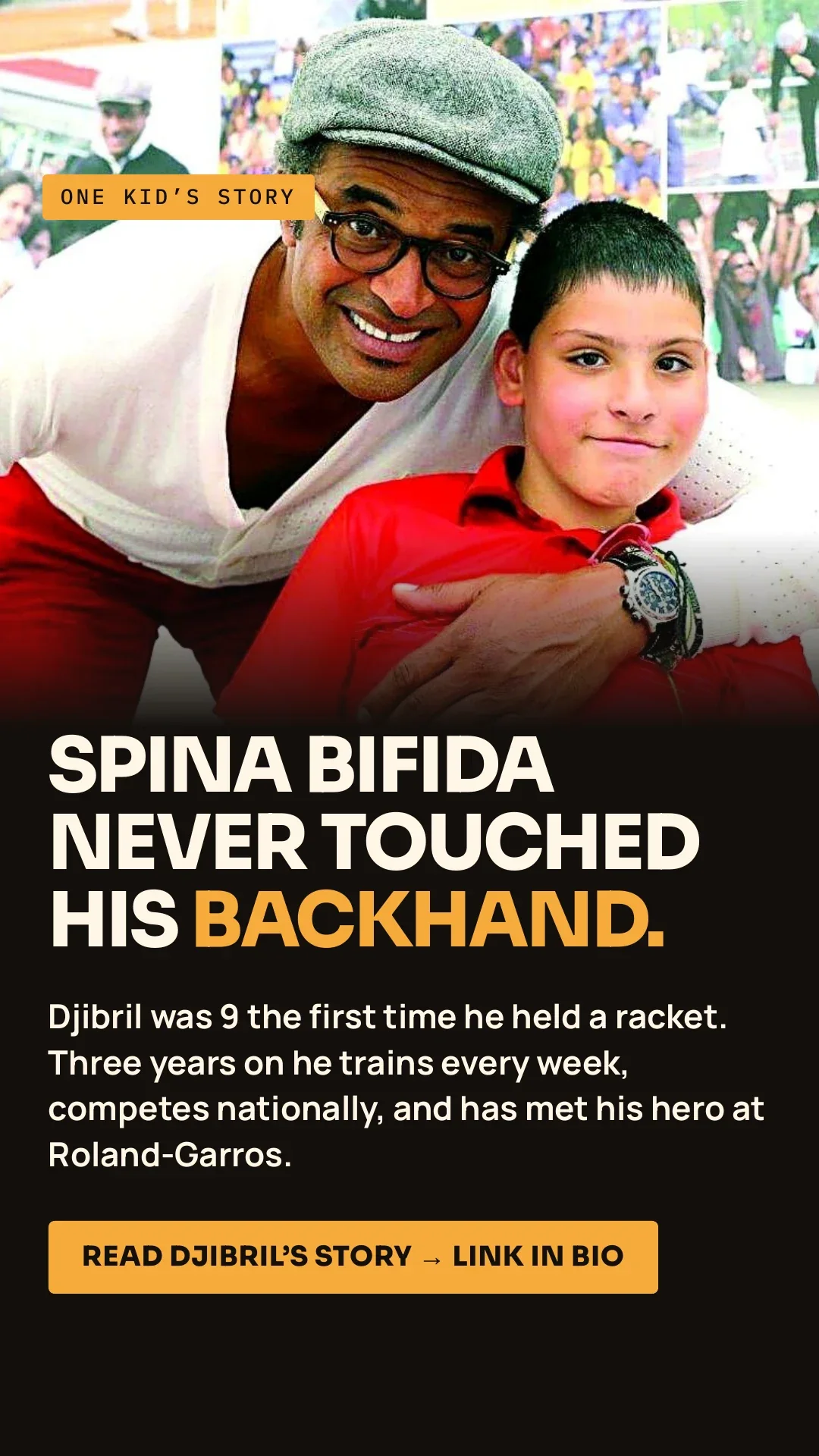
Personal story
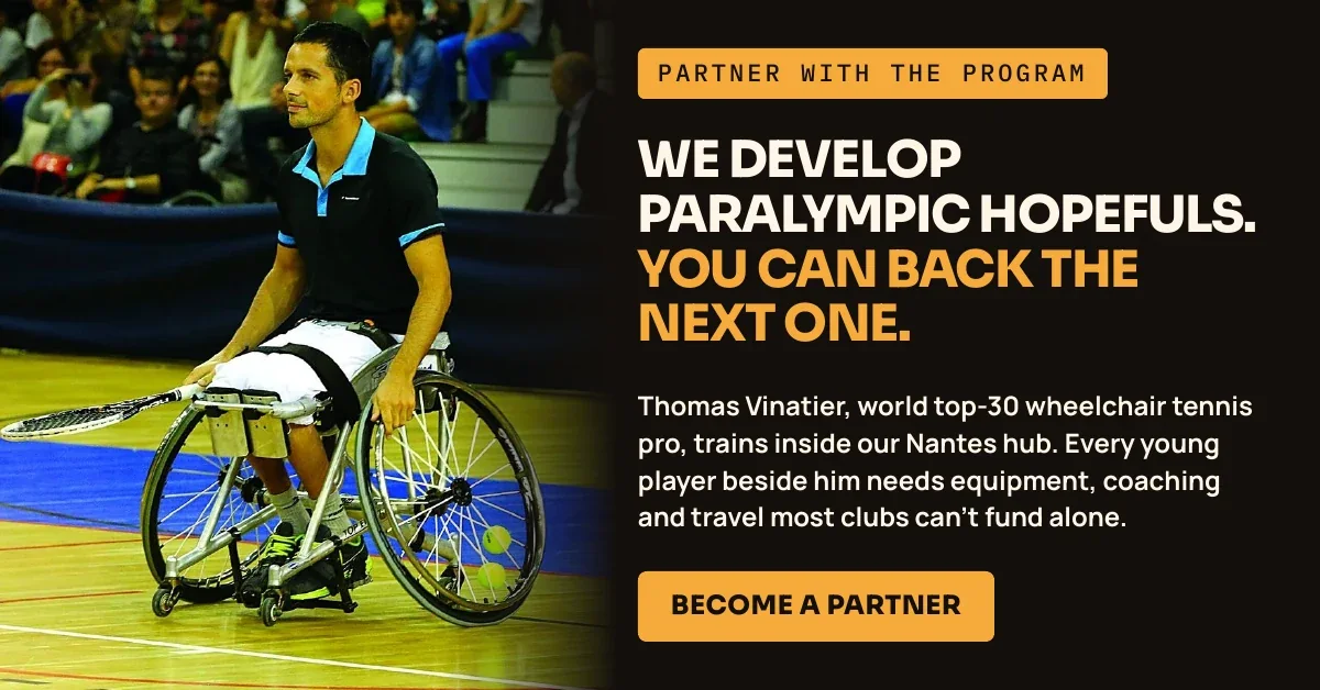
Corporate partner call to action
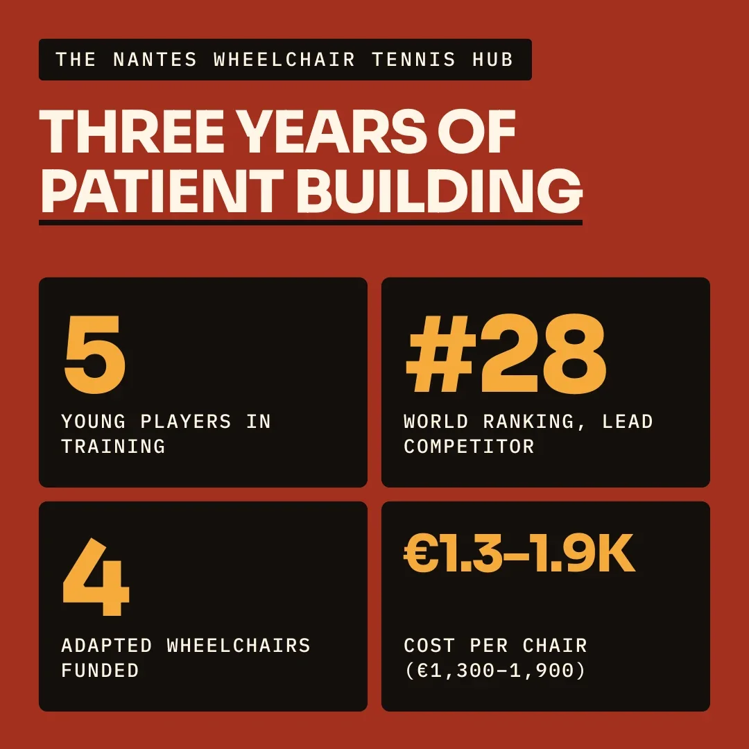
Program data, redesigned
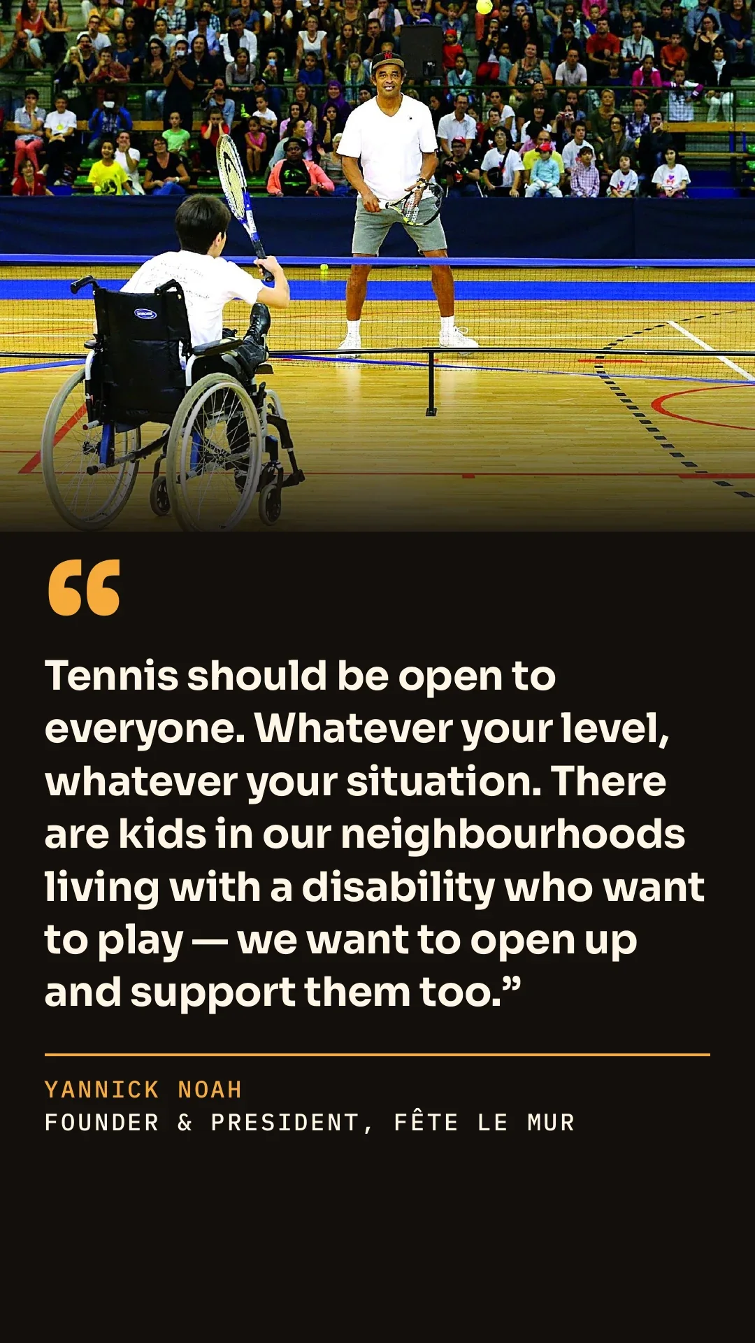
Founder quote
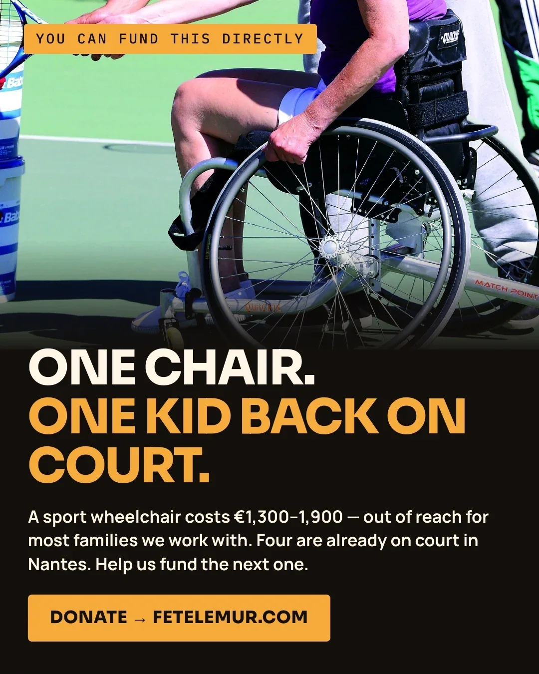
Direct fundraising ask
Why it matters
Recurring work for one organisation, in one visual language.
- Illustration & icon systems Nine themed sets, one visual language, reused across every later deliverable
- Reports & presentation decks 122-page annual report, kept as editable files so each new edition starts from the last
- Event & signage collateral National poster, sponsor-compliant across eleven real brand guidelines
- Program & funding documents The brochure that justified and launched a new accessibility program
- Format extension, years later A 2026 social pack built from the same archive, still on-brand
Beyond what is shown here, I also designed booklets for Fête le Mur’s local sites: one for double dutch workshops, one for an event around two members taking part in the women’s Rallye des Gazelles, and one for an exchange between a French city and a city in Senegal, plus a few others. Those files were lost with a hard drive, so they are not pictured.
If one organisation trusted it year after year, it holds up for your pipeline.
Monthly retainers for ongoing decks, ad variations, brand rollouts and motion assets: fixed rate, zero hiring overhead.